In the constantly changing digital world, the significance of typography design and font styles is paramount. Choosing the right font is key to the success of website designs, social media posts, and mobile apps. It’s not just about looks—your font choice plays a vital role in making a lasting impression and connecting with your audience.
As visual creatures, we naturally gravitate toward aesthetically pleasing typography. Studies have shown that the choice of font can dramatically influence reader engagement and information retention.
Studies from the University of California, San Diego, show that readers understand information more effectively when it’s presented in fonts like Garamond or Helvetica. These simple, clear fonts make content more accessible and easier to read, which is crucial in today’s fast-paced digital world.
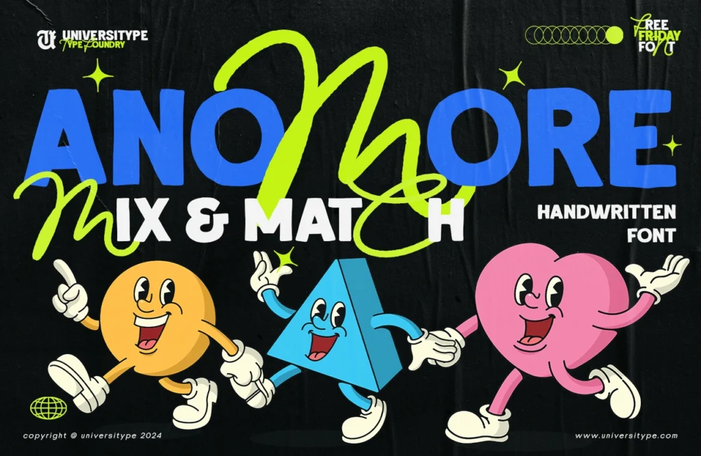
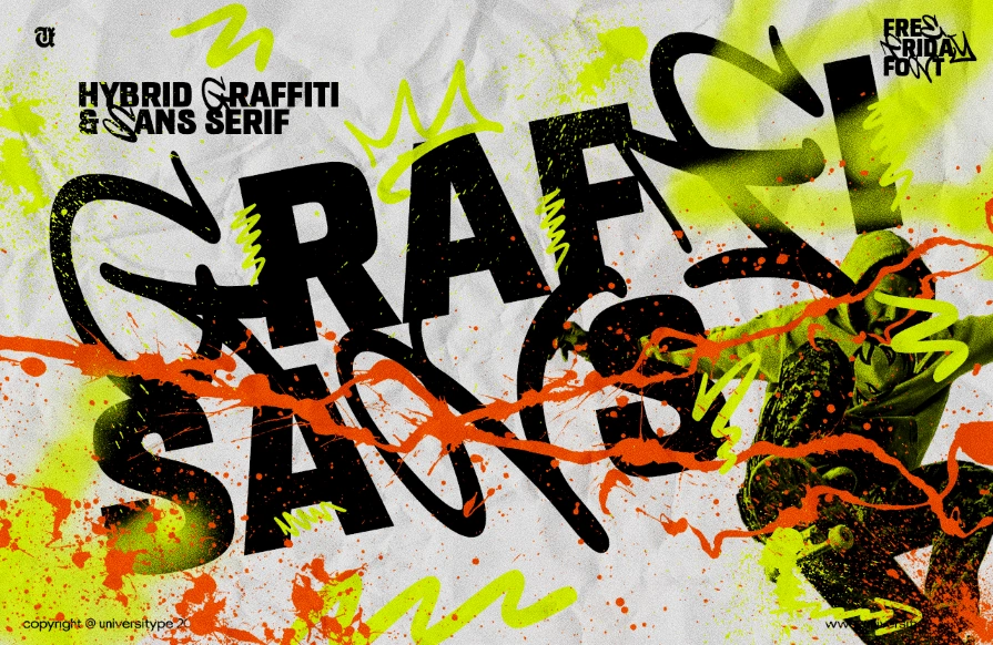
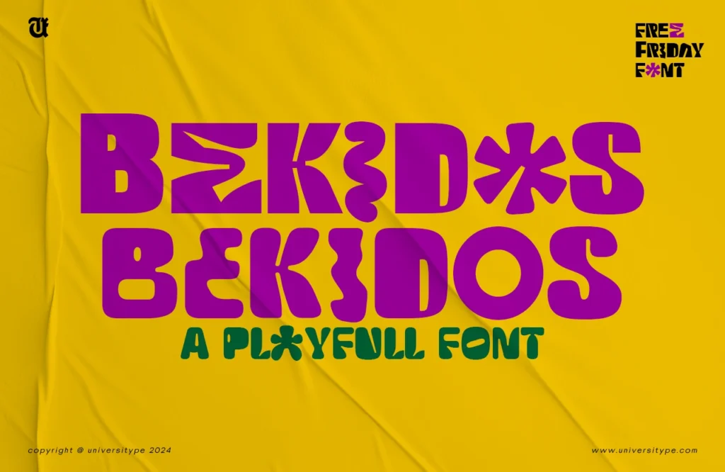
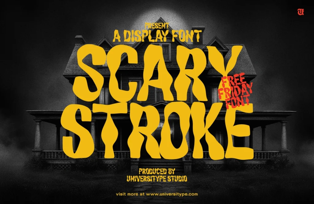
However, the impact of font styles extends beyond mere readability. The right typeface can shape the overall tone and personality of your digital content. Playful fonts like Pacifico or Kalam create a casual, friendly vibe, perfect for brands that want to appear approachable. Elegant serif fonts like Bodoni or Didot add sophistication and professionalism, ideal for luxury brands.
A Canva Design School survey found that 65% of designers view font selection as crucial in web design. Experts agree, emphasizing the need to match fonts with a brand’s identity and audience. The font you choose should not only be visually appealing but also align with your brand’s core messaging. This alignment ensures that the typography design complements the overall brand narrative, enhancing the user experience.
Lara Donn, a renowned graphic designer, emphasizes, “The right font can make or break a design. It’s essential to choose a typeface that looks appealing and aligns with your brand’s messaging and tone.” This perspective highlights the importance of thoughtful font selection as a key element of successful digital design.
When selecting a font, it’s essential to strike a balance between aesthetics and functionality. Bold, attention-grabbing fonts might be tempting, but they can sometimes compromise readability, especially in large blocks of text. The Nielsen Norman Group study shows users prefer serif fonts for readability in long text and sans-serif fonts for a modern look in headings.
Ultimately, the world of font styles is vast and dynamic, offering endless possibilities for creative expression and brand identity. By understanding the nuances of typography and embracing the power of font selection, you can create a more meaningful connection with your audience.
Typography isn’t just about aesthetics; it’s about making your content resonate, engage, and communicate effectively. Whether designing a website, social media campaign, or mobile app, selecting the right font is crucial for successful digital design.

