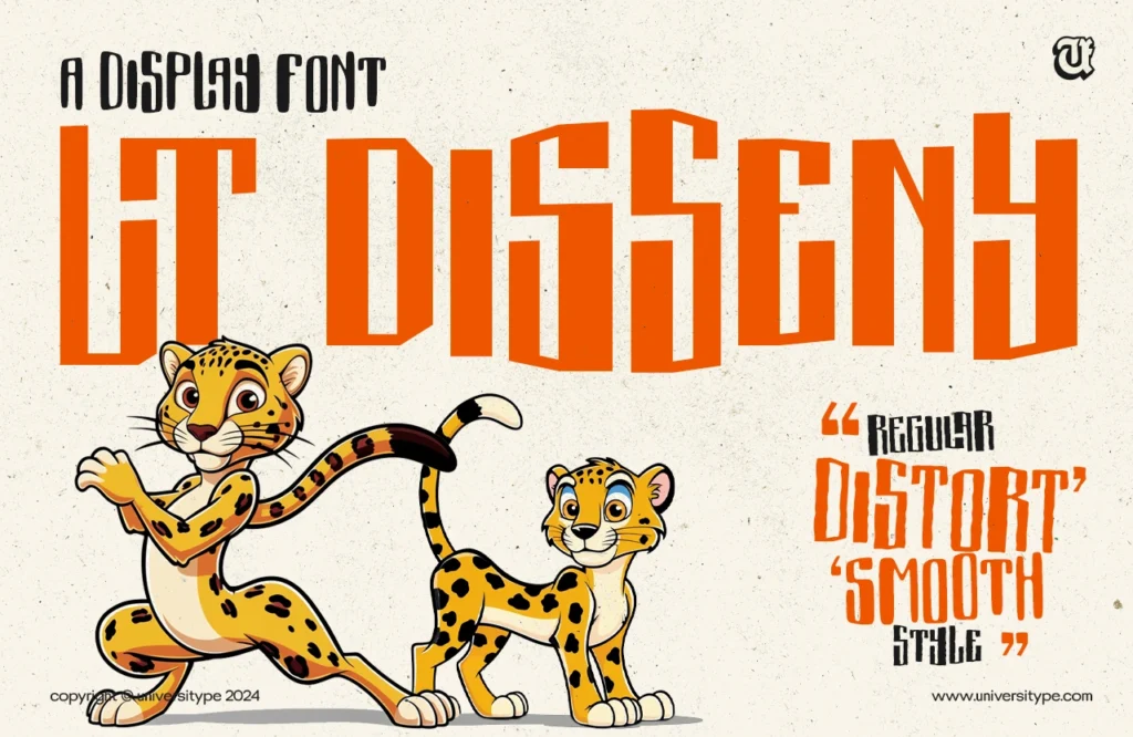
Negative-space typography transcends mere aesthetic trends; it represents a significant design principle that utilizes the space surrounding and between letters to produce impactful visual effects. This article examines the foundational concepts associated with negative space, its ability to enhance balance and interest in design, and presents inspiring examples that demonstrate its potential.
Furthermore, the article offers practical tips for effectively incorporating this technique into one’s work, as well as highlighting common pitfalls to avoid. The discussion also addresses emerging trends in negative-space typography, ensuring that readers remain informed in the ever-evolving design landscape.
Engage with this content to uncover the intricacies of this compelling design approach.
Understanding Negative-Space Typography
Understanding negative-space typography is fundamental for graphic designers aiming to create visually compelling layouts that effectively communicate messages through a deliberate composition of letters, shapes, and spaces. This design approach employs the concept of white space to enhance legibility and readability, transforming empty areas into powerful elements of creativity and artistic expression.
By applying the principles of design thinking, designers can develop typographic layouts that engage viewers and establish a robust visual hierarchy, ultimately enhancing the audience’s perception of the brand or message being conveyed.
Definition and Principles
Negative-space typography refers to the strategic use of white space surrounding letters and shapes to enhance the overall composition and aesthetic quality of a design. This innovative approach not only adds visual interest but also underscores the significance of clarity in communication.
By carefully managing negative space, designers can establish a harmonious relationship between positive and negative elements, which is essential for maintaining text legibility and improving readability. The principle of clarity ensures that viewers can easily differentiate between letterforms and their surrounding space, while balance is achieved through deliberate placement that naturally guides the viewer’s eye.
The effective use of space fosters a more engaging interaction, allowing the audience to concentrate on the message without distractions. These foundational principles in negative-space typography play a crucial role in creating impactful and memorable designs.
The Impact of Negative Space on Design
The significance of negative space in design is profound, as it plays a pivotal role in establishing balance and visual interest, thereby captivating viewers and enhancing artistic expression.
By meticulously considering the interaction between negative space and graphic elements, designers can effectively direct the viewer’s attention and convey messages with greater impact. This strategic approach facilitates a minimalist aesthetic, where each letter, font choice, and shape is purposeful, ultimately contributing to a cohesive branding strategy and effective communication.
Creating Balance and Visual Interest
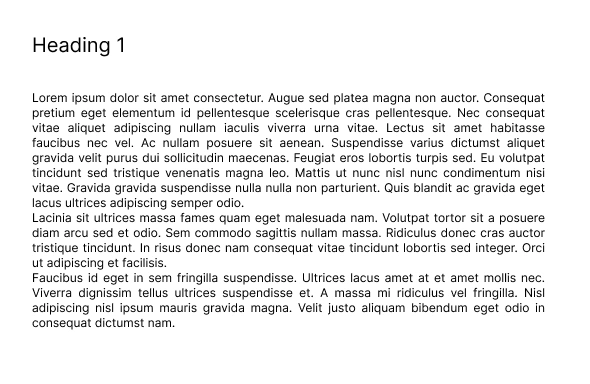
Creating balance and visual interest in design necessitates the strategic application of contrast between negative and positive space, ensuring that typography and graphic elements harmonize effectively.
To achieve this, it is essential to comprehend how negative space—the empty areas surrounding and between design elements—can be leveraged to enhance clarity and focus. For instance, when designing a poster, providing sufficient white space around the main headline can effectively draw the viewer’s eye and create a more impactful visual experience.
The use of contrast through color and size is imperative; employing a bold typeface for headings against a lighter background can establish a striking visual hierarchy. Additionally, incorporating various font sizes and weights can direct the viewer’s attention and facilitate a clear reading flow, resulting in a design that is both aesthetically pleasing and functional.
Examples of Negative-Space Typography
Negative-space typography serves as an exemplary illustration of contemporary design trends, demonstrating how this innovative approach effectively captures attention and fosters creativity across various mediums.
A significant number of designers employ negative space to create impactful logos, posters, and promotional materials that not only emphasize the brand’s identity but also elicit emotional responses from the audience.
By analyzing the various artistic techniques evident in these examples, one can recognize the effectiveness of negative-space typography in enhancing visual storytelling and establishing a memorable visual identity.
Inspiring Designs and Techniques
Inspiring designs that utilize negative-space typography often employ distinctive techniques that promote creativity in design and enhance visual storytelling.
These innovative methods can transform ordinary text into captivating works of art, facilitating a deeper connection with the viewer. By skillfully arranging letters and imagery, designers are able to create illusions and evoke emotions that enrich the communication process.
Software tools such as Adobe Illustrator and Canva offer excellent platforms for exploring negative space, allowing users to manipulate shapes and forms with ease. The use of color contrasts and minimalistic layouts can further amplify the effects of negative space, rendering messages more impactful and memorable.
The strategic application of these design principles can significantly influence the viewer’s perception and level of engagement.
How to Incorporate Negative Space in Your Designs
.jpg_10.jpeg)
Incorporating negative space into design requires a deliberate approach and a comprehensive understanding of design strategy, which can significantly enhance the overall effectiveness of visual communication.
By employing design software and implementing specific techniques, designers can create layouts that utilize white space effectively while also engaging the audience more profoundly.
This practice necessitates careful consideration of typography, shapes, and spatial relationships to ensure clarity and balance in each project.
Tips and Tricks for Effective Use
Utilizing effective strategies for incorporating negative space can significantly enhance the clarity and visual impact of design work.
This technique not only improves aesthetic appeal but also promotes greater viewer engagement with the content. By adeptly manipulating the spaces surrounding and between typography, designers can establish a more pronounced visual hierarchy, directing the audience’s attention to the most critical elements. Thoughtful consideration of spatial relationships contributes to a deeper understanding of how various components interact within the layout.
It is essential to recognize that negative space is not merely the absence of content; rather, it functions as a powerful tool that can shape the overall mood and message of the design, fostering a harmonious balance between form and function.
Common Mistakes to Avoid
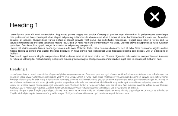
Common mistakes in the use of negative space can significantly hinder the effectiveness of a design, resulting in challenges that adversely affect both legibility and audience engagement.
It is essential for designers to understand these prevalent errors, such as overcrowding elements or failing to maintain a balanced distribution of space. By learning to identify and avoid these pitfalls, designers can enhance their work, ultimately leading to improved readability and a more compelling visual narrative.
Pitfalls and How to Fix Them
Addressing common pitfalls in negative-space typography necessitates the identification of areas where clarity is compromised, followed by essential adjustments to enhance the overall design.
This prompts designers to critically assess their work for instances where text may become obscured by clutter or where spaces may appear disjointed, ultimately leading to confusion rather than clarity. A prevalent issue often arises from insufficient contrast between the typography and its background, which can result in significant readability challenges. To mitigate this, designers should employ contrast analysis techniques, utilizing principles of color theory to ensure optimal visibility.
The implementation of grid systems can further enhance layout cohesion, facilitating more effective management of negative spaces. By consistently revisiting these design elements, designers can successfully implement improvements that lead to cleaner and more impactful typography.
The Future of Negative-Space Typography
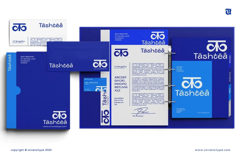
The future of negative-space typography is set to experience significant advancements as design trends continue to evolve and new innovations in digital design emerge, fundamentally transforming approaches to visual communication.
With an increasing focus on minimalism and the strategic use of space, designers are venturing into new realms that enhance viewer engagement and promote artistic expression. This progression highlights the critical importance of design education, as emerging designers are trained to effectively utilize negative space as an essential component of their creative practices.
Trends and Innovations
Current trends and innovations in negative-space typography signify a significant shift towards more integrated and thoughtful visual identities within branding strategies. This approach not only challenges traditional design principles but also encourages viewers to engage more profoundly with the content, resulting in a more memorable and impactful interaction.
Brands are increasingly acknowledging the efficacy of negative space to convey messages succinctly and creatively, effectively capturing attention in an overcrowded marketplace. For example, prominent companies such as FedEx and the World Wildlife Fund have adeptly employed this technique, utilizing the spaces surrounding and within their logos to create dual meanings and enhance their overall visual storytelling.
These examples illustrate how the effective incorporation of negative-space typography can elevate a brand’s visual identity, rendering it not only recognizable but also emotionally resonant with consumers.


