In the ever-evolving field of web design, typography is integral to capturing attention and effectively conveying messages. Customizing typography with appropriate font styles and embedding Google Fonts can significantly enhance user experience.
Google Fonts provides an extensive array of diverse font options, including script subsets and font effects, that are both stylish and straightforward to implement.
This guide will cover the fundamental aspects of Google Fonts, including the selection of the ideal typeface, font customization, and the seamless embedding of fonts into your website using either the HTML file or CSS file.
Additionally, best practices for customizing typography to improve readability and visual appeal will be discussed.
Prepare to enhance your design proficiency.
Key Takeaways:Choose from a wide selection of fonts with Google Fonts, making it easy to customize typography on your website.Embedding fonts in CSS using the @import method allows for easy implementation and ensures optimized performance for web use.When using Google Fonts, limit the number of fonts used, consider readability and legibility, and use contrast for emphasis to achieve the best results.
What Are Google Fonts?
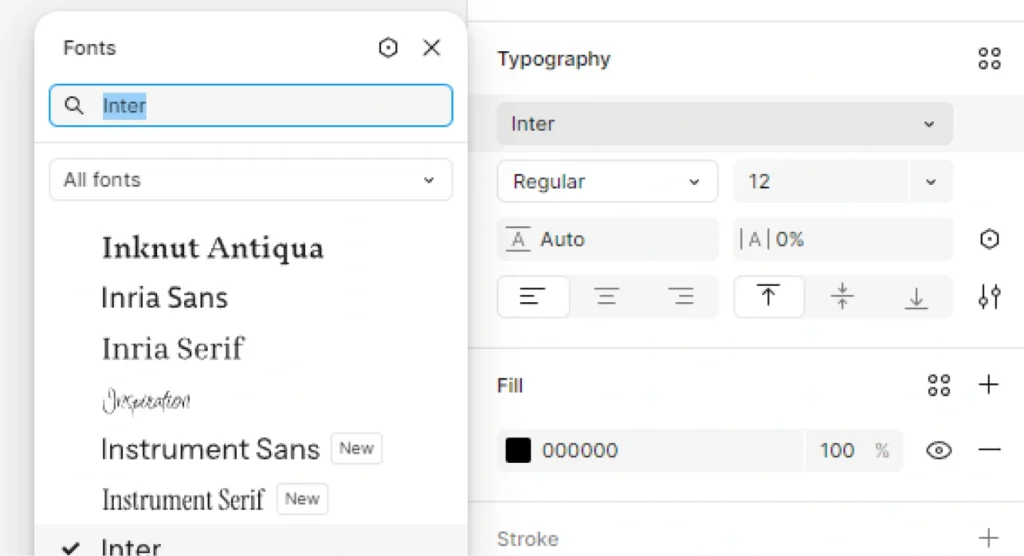
Google Fonts is a vast library that provides a wide array of free and open-source web fonts, allowing designers and developers to enhance their web design projects by customizing typography effortlessly. It offers various font subsets and font effects to match different design needs.
This library includes popular font families like Roboto, Open Sans, Inconsolata, Tangerine, and Droid Sans, making it a top choice for anyone looking to apply diverse font styles to their websites and applications.
How To Use Google Fonts?
Using Google Fonts in your web projects is straightforward and can significantly enhance the visual appeal of your site through effective typography customization. By embedding Google Fonts directly into your HTML file or using the @import method in your CSS file, you can easily access a variety of font families and customize font weights and font styles to suit your design needs.
Choosing Fonts
Choosing the right font from Google Fonts is essential as it sets the tone and aesthetic of your web design, providing an opportunity to select from a diverse range of font families like Roboto, Open Sans, and Cantarell to best fit your brand identity. Each font style can convey different emotions and messages, making it crucial to match your typography with your content.
When selecting a font, it’s important to consider not just the visual appeal, but also how it aligns with your brand identity. A font used in a tech startup may differ greatly from one used in a luxury brand.
Here are some key aspects to keep in mind:
- Readability: Ensure your chosen font is easy to read across various devices. Fonts like Montserrat and Lora excel in this area.
- Emotional Impact: Fonts evoke emotions; for instance, script-type fonts can convey elegance, while sans-serif fonts often feel modern and straightforward.
- Contextual Use: Consider where the font will be used—headlines demand attention, while body text needs clarity.
By focusing on these elements, one can ensure that the chosen typography not only resonates visually but also supports the overall narrative of the brand.
Adding Fonts to Website
To effectively add Google Fonts to your website, you can utilize either the HTML file or CSS file to ensure the proper embedding of the font families you wish to use. This process involves specific font requests that allow you to use various font weights and styles directly within your web design. Additionally, using the Google Fonts API can simplify the process even further.
By following these steps, you can enhance the typography of your site, making it more visually appealing.
First, navigate to the Google Fonts website and select the fonts that capture the essence of your project’s design. You can customize your selection by choosing various styles and weights.
After deciding on your preferred fonts, you’ll notice an option to embed them either via an HTML link or CSS @import method. For seamless integration,
- Copy the provided
<link>tag if you are using HTML. - Alternatively, choose the
@importstatement to include in your CSS file.
Regardless of the method you choose, don’t forget to include appropriate font-family declarations in your CSS to apply the chosen fonts effectively. You may also consider using a local font or @font-face rule for fallback options. This ensures that your website retains a consistent and polished look across different devices and web browsers.
Embedding Fonts in CSS
Embedding Google Fonts in your CSS file using the @import method is a practical way to streamline your web design and maintain clean, organized code. By specifying font-family and the desired font weights and styles, you can easily implement various typographic effects across your website. Additionally, using text shadow and font display properties can further enhance your web typography.
- h1 { font-weight: 700; }
- p { font-weight: 400; }
To enhance readability, it’s advisable to structure your CSS logically by grouping similar styles together and using comments to indicate sections. For example:
| Section | Styles |
|---|---|
| Typography | font-family, font-weight, font effect |
| Colors | color, background-color |
When opting for the @import method, one enjoys seamless integration of diverse font styles without cluttering the HTML files. This technique aids in keeping styles centralized, which enhances maintainability. To begin, you can insert a simple import statement at the top of your CSS file:
- @import url(‘https://fonts.googleapis.com/css2?family=Roboto:wght@400;700&display=swap’);
This line imports the Roboto font with standard and bold weights. For implementing different font styles, you can add directly to your CSS rules:
- body { font-family: ‘Roboto’, sans-serif; }
- h1 { font-weight: 700; }
- p { font-weight: 400; }
To enhance readability, it’s advisable to structure your CSS logically by grouping similar styles together and using comments to indicate sections. For example:
| Section | Styles |
|---|---|
| Typography | font-family, font-weight |
| Colors | color, background-color |
Why Use Google Fonts?
Google Fonts offers a compelling solution for web typography, providing an extensive library with a wide selection of fonts that are both easy to implement and optimized for web performance. This allows designers and developers to enhance their projects with customized typography while ensuring a fast and responsive user experience. Integrating Google Fonts can also improve PX engagements and help establish a clear font key for your design system.
Wide Selection of Fonts
One of the primary advantages of Google Fonts is the wide selection of font families and styles available, offering everything from classic serif and sans-serif fonts like Roboto and Open Sans to more unique and artistic options. This extensive variety, including handwritten fonts and modern sans-serif, enables designers to find the perfect typography to match their project’s specific needs.
What makes this resource truly invaluable is the ability to cater to various design trends, ensuring that every brand’s personality can shine through. Designers can seamlessly select from:
- Modern Sans-Serif: Perfect for clean, minimalistic designs where clarity is key.
- Classic Serif: Ideal for more traditional brands that exude professionalism and reliability.
- Handwritten Fonts: Excellent for conveying a personal touch, often used in creative marketing campaigns.
These diverse font families not only enhance visual appeal but also significantly contribute to effective branding strategies, allowing companies to establish a distinct voice in a crowded marketplace.
Easy to Implement
Implementing Google Fonts into your web design is incredibly easy, with straightforward methods for embedding fonts in both your HTML file and CSS file that require minimal coding knowledge. This accessibility enables designers and developers of all skill levels to enhance their projects effortlessly.
By employing these methods, even novices can create visually appealing typography that enhances user experience and aesthetic appeal. This streamlined process not only fosters creativity but also encourages a wider adoption of quality typography across the web design community, including platforms like GeeksforGeeks.
This simplicity is showcased through easy integration techniques. For instance, one can include a Google Font by simply adding a link in the head section of the HTML file, such as:
<link href='https://fonts.googleapis.com/css?family=Roboto' rel='stylesheet'>Applying the font in CSS becomes just as seamless:
body { font-family: 'Roboto', sans-serif; By employing these methods, even novices can create visually appealing typography that enhances user experience and aesthetic appeal.
This streamlined process not only fosters creativity but also encourages a wider adoption of quality typography across the web design community.
Optimized for Web
Google Fonts is specifically optimized for the web, ensuring that font requests are efficient and that the fonts load quickly across various web browsers, positively impacting user experience. This optimization is crucial for maintaining performance while delivering high-quality typography.
When utilizing Google Fonts, developers must understand that optimizing font delivery not only enhances aesthetic appeal but also contributes to overall site performance. Fast loading fonts significantly reduce barriers to accessing content, thereby maintaining user engagement and satisfaction.
By leveraging techniques such as:
- subsetting font weights and styles
- utilizing asynchronous loading
- preloading critical fonts
By embedding Google Fonts and efficiently managing font files, websites can minimize render-blocking time.
It’s essential to regularly audit font usage to ensure that only necessary styles are incorporated, ultimately decreasing the data needed to load the page. Such practices play an integral role in achieving a seamless and efficient user experience, making it imperative for web designers to prioritize these strategies.
How To Customize Typography With Google Fonts and the Google Fonts API?
Customizing typography with Google Fonts and embedding them within your HTML file allows designers and developers to create visually stunning web pages that resonate with users, making it an essential skill in web design.
By adjusting various elements like font size, font weight, and adding unique font effects through your CSS file, you can achieve a distinctive look that enhances readability and engagement.
Adjusting Font Size
Adjusting font size is a fundamental aspect of typography customization, allowing you to control how text appears on your web design, enhancing both aesthetics and readability. By specifying font size in your CSS file, you can ensure that text is appropriately sized for different devices and screen resolutions.
Ultimately, effective font size management is crucial for user engagement and accessibility, significantly impacting the overall design.
To successfully implement responsive font sizes, web designers often rely on various CSS units such as em, rem, and percentage values. Each of these units offers distinct advantages in creating a seamless user experience across smartphones, tablets, and desktop screens.
For instance, using rem units allows the font size to scale proportionally based on the root element, providing a more consistent look. Employing media queries can assist in adjusting font sizes dynamically, depending on the viewport size.
Consider the following methods to improve typography:
font-size: 16px;– standard size for readability.font-size: 2vw;– responsive text that changes with viewport width.- Utilizing media queries to optimize fonts, e.g.,
@media (max-width: 600px) { font-size: 14px;.
Ultimately, effective font size management is crucial for user engagement and accessibility, significantly impacting the overall design.
Changing Font Weight
Changing font weight is another essential element of typography customization that can dramatically influence the appearance and legibility of your text. With Google Fonts, you have access to various font weights, allowing you to choose lighter or bolder styles to create visual contrast and emphasize important content.
The impact of font weight on design is profound, as it not only affects readability but also sets the tone for the overall aesthetic of a webpage. By blending contrasting weights, such as bold headings with light subtext, designers can guide the viewer’s eye and enhance the message conveyed through the text.
For instance, using a 700 weight for headlines and 400 weight for paragraphs can create a clear hierarchy in information presented.
- 400 weight: Ideal for body text, ensuring comfort in reading and coherence.
- 700 weight: Perfect for calls to action or highlighting key points, drawing immediate attention.
By thoughtfully adjusting these weights, one can achieve a balanced and visually appealing design, making it easier for users to engage with the content on platforms like GeeksforGeeks.
Adding Font Styles
Adding font styles, such as italics or underlining, is a powerful way to enhance the visual appeal of your text and create emphasis within your design. With Google Fonts, incorporating additional styles and effects like text shadow can further elevate the typography of your web project.
Utilizing Google Fonts opens up a myriad of possibilities for enhancing typography. It’s essential to recognize how varying styles can improve text hierarchy and captivate your audience’s attention.
By selecting fonts such as Roboto for body text and Tangerine for headings, you can create a delightful contrast that guides the reader’s eye.
- Bold for a stronger impact
- Italic for emphasis and nuance
- Underlined for hyperlinks or important notes
- Text shadow for depth and intrigue
Experimenting with these options will not only enhance readability but also elevate the overall aesthetic of your web design.
What Are The Best Practices For Using Google Fonts?
When utilizing Google Fonts in your web design, adhering to best practices is crucial to ensure that your typography remains effective and visually pleasing.
Key practices include:
- Limiting the number of fonts used
- Prioritizing readability
- Implementing contrast for emphasis
These practices help create a cohesive and engaging user experience.
Limit the Number of Fonts Used
Limiting the number of fonts used in your design is a fundamental principle that helps maintain visual coherence and prevents overwhelming users with too much variety from Google Fonts’ extensive collection. Opting for two to three font families can create a well-structured and aesthetically pleasing layout.
Incorporating a restricted font selection can significantly enhance the overall user experience, allowing the audience to focus on the message rather than being distracted by competing styles. When designers adhere to this principle, they foster a sense of harmony throughout the visual composition.
For instance, the combination of Roboto for body text and Merriweather for headings creates a pleasing contrast that is both functional and elegant. Similarly, using Lora paired with Open Sans not only improves readability but also adds a touch of sophistication.
- Limit your selections to two or three font families.
- Consider how well the fonts complement each other.
- Test the readability across different devices.
Consider Readability and Legibility
Ensuring readability and legibility should be a top priority when selecting fonts from Google Fonts, as it directly impacts the user’s ability to consume your content effectively.
Choosing appropriate font styles and sizes is crucial for making text easily digestible on various devices and screen sizes.
The significance of readability and legibility extends beyond mere aesthetics; it influences user engagement and comprehension. Factors such as font choice, size, and spacing contribute significantly to how text is perceived. For instance, sans-serif fonts often enhance readability on digital screens, while size adjustments can make a world of difference for varying audience demographics.
Adequate line spacing improves legibility, preventing the text from feeling cramped.
- Font Choice: Opt for clear, modern designs that maintain consistency.
- Size: Generally, a font size of 16px serves as a baseline for comfortable reading.
- Spacing: 1.5 line height is often recommended for better clarity.
When evaluating options on Google Fonts, consider running quick tests by displaying sample text to see how it performs across devices. This will help achieve not only aesthetic appeal but also remarkable functionality in readability.
Use Contrast for Emphasis
Utilizing contrast effectively within your typography can significantly enhance visual hierarchy and ensure that key elements stand out, creating a more engaging experience for users.
By employing contrasting font styles, sizes, and colors from Google Fonts, you can guide users’ attention to important information.
Contrast plays a pivotal role in drawing the viewer’s eye to essential elements, making it a valuable tool in design. For instance, pairing a bold, sans-serif font like Montserrat with a lighter serif font such as Playfair Display can create a striking visual effect that not only captivates but also directs focus.
Consider the following strategies for maximizing contrast in typography using Google Fonts like Inconsolata and Droid Sans:
- Size Variations: Use larger text for headings to establish hierarchy.
- Color Choices: Combine dark text against a light background and vice versa.
- Font Weights: Differentiate sections using varying font weights to emphasize key messages.
By thoughtfully implementing these contrasting elements, designers can foster better engagement and improve the user experience through effective use of Google Fonts.
Conclusion
In conclusion, Google Fonts offers an invaluable resource for designers and developers seeking to elevate their web design through customizable typography, whether incorporating Open Sans or Cantarell for different styles.
By tapping into this extensive library, users can access a multitude of font styles that enhance readability and contribute to their site’s overall aesthetics. Selecting the right typeface can significantly impact user engagement, making understanding font characteristics crucial.
As you explore the vast collection, consider the following best practices to maximize effectiveness:
- Choose fonts that align with your brand identity.
- Limit the number of different fonts to maintain a cohesive look.
- Optimize loading times by selecting font weights judiciously.
Ultimately, utilizing Google Fonts not only simplifies typography management but also fosters a more engaging and polished web experience for visitors, enhancing PX engagements significantly.
How do I customize typography with Google Fonts?
To customize typography with Google Fonts, first go to the Google Fonts website. Then, browse through the selection of fonts, such as Roboto, Open Sans, Inconsolata, and choose one that you like. Once you have selected a font, click on the “Select this Font” button and then click on the “Customize” tab. Here, you can adjust the font size, weight, style, and other settings to customize the typography to your liking.
Can I use Google Fonts on my website?
Yes, you can use Google Fonts on your website. Simply select the font you want to use, like Tangerine or Droid Sans, and then click on the “Embed” button. Copy the provided code and paste it into the section of your website’s HTML file. This will allow you to use the Google Font on your website.
How can I preview a Google Font before using it?
To preview a Google Font before using it, go to the Google Fonts website and select the font you are interested in, such as Cantarell. Then, click on the “Preview” button to see how the font will look with different text and settings. This will give you an idea of how the font will appear on your website, especially when using the Google Fonts API.
Are all Google Fonts free to use?
Yes, all Google Fonts are free to use. However, some fonts may have certain restrictions or licenses attached to them. It is important to check the font’s usage restrictions before embedding Google Fonts on your website.
Can I use Google Fonts in my design projects?
Yes, you can use Google Fonts in your design projects. Many designers use Google Fonts as they are free and available for a wide variety of options. Consider using them in your HTML and CSS files to ensure consistency. Just make sure to check the font’s usage restrictions before using it in any commercial projects.
Is it possible to download Google Fonts for offline use?
Yes, it is possible to download Google Fonts for offline use. On the Google Fonts website, select the font you want to use and then click on the “Download” button. This will download the font to your computer in a zip file, which you can then install and use in any design or document software, such as those offered by GeeksforGeeks.

