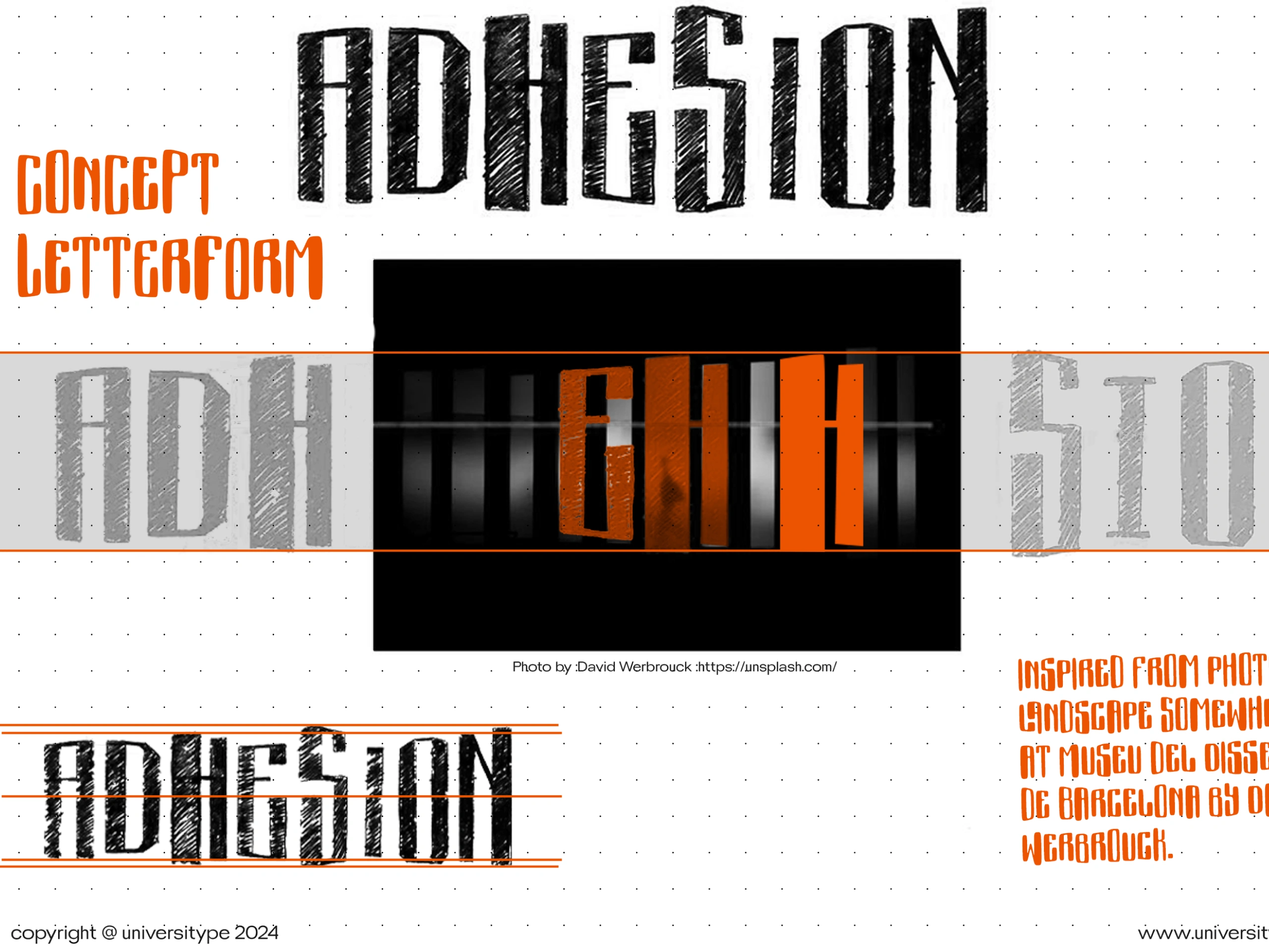
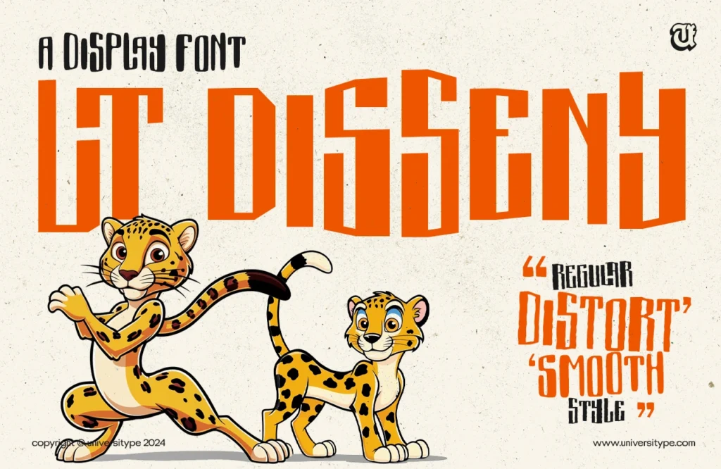
In the heart of Barcelona, where modernism meets innovation, stands the iconic Museu del Disseny, a beacon of creativity and architectural brilliance. It was from the bold angles and geometric forms of this architectural masterpiece that UT Disseny was born. More than just a typeface, UT Disseny captures the very soul of the museum – a place where tradition meets cutting-edge design.
The Vision Behind UT Disseny
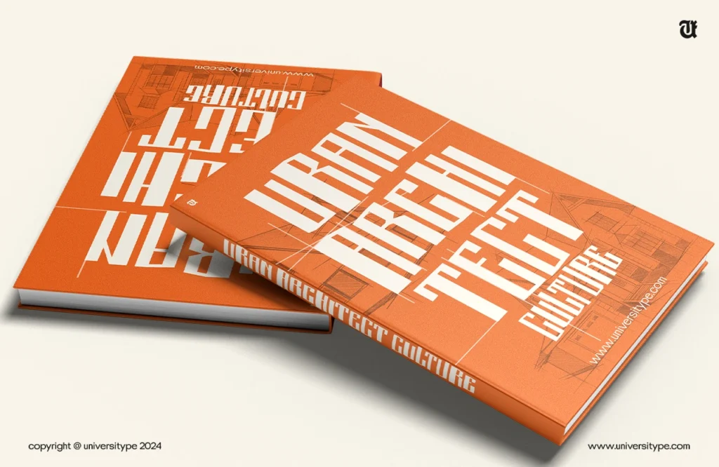
Inspired by the towering structures and sleek lines of the Museu del Disseny, UT Disseny was crafted to bring architectural beauty to the world of typography. Like the museum, which juxtaposes history with the avant-garde, the font fuses geometric precision with artistic fluidity.
Each stroke of UT Disseny pays homage to Barcelona’s design legacy, creating a font that is not only bold and modern but rooted in the city’s rich cultural and architectural heritage.
Design Details: A Typeface Sculpted by Architecture
As you explore UT Disseny, you’ll notice how its letterforms echo the sharp lines and fluid curves of architectural design. Classified as a sans-serif display font, it embraces a modern, minimalist aesthetic. Its clean, geometric forms are softened by subtle, deliberate curves, much like the harmonious balance between steel and stone seen in Barcelona’s most famous buildings.
The Distort variation adds a playful twist to the original design, evoking the idea of movement and change – as if the very walls of the museum were shifting under the weight of time. Meanwhile, the Smooth variation rounds out the font’s sharpness, bringing a polished, organic feel reminiscent of the smooth textures found in the museum’s interior spaces.
A Family of Styles
Just as the Museu del Disseny houses diverse collections, UT Disseny offers its own array of styles to suit different creative needs:
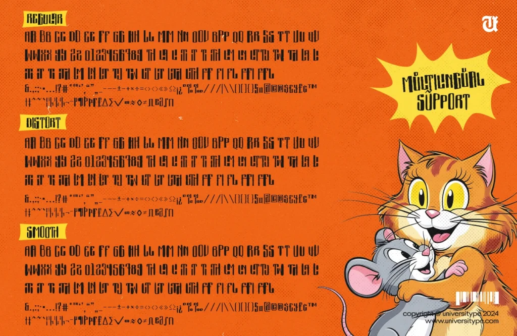
- Regular: The foundation, perfect for achieving balance and clarity in any design.
- Distort: A bold, experimental twist on the traditional, with warped elements that create visual movement.
- Smooth: A softer, more refined version with rounded edges for a contemporary, polished look.
Each variation invites you to explore a different side of the font’s architectural inspiration, allowing for endless creative possibilities.
Whether you’re working on editorial design, branding, or web projects, UT Disseny stands ready to adapt. Its bold, structured design is ideal for headlines, logos, and eye-catching display text, while its versatility makes it perfect for both print and digital applications.
With its support for multiple languages and special characters, UT Disseny ensures that your message comes across clearly, no matter the context or audience. Its precision and adaptability make it as functional as it is visually stunning.
Technical Specifications
Crafted with the needs of designers in mind, UT Disseny is available in the OTF format, ensuring seamless integration with all major design software, from Adobe Creative Suite to Microsoft Office. The font’s precision and clarity hold up across media, from high-resolution prints to responsive web layouts, making it the perfect addition to any designer’s toolkit.
Discover the Architectural Elegance of UT Disseny
More than just a typeface, UT Disseny invites you to step into the world of design as seen through the eyes of an architect. It’s a font that tells a story – one of structure, innovation, and timeless beauty. Just as the Museu del Disseny reshapes the way we experience space, UT Disseny reshapes the way we experience typography.
Unlock the creative potential of UT Disseny today, and let your designs be inspired by the same architectural principles that shaped Barcelona’s skyline.
For inquiries, support, or custom licensing, contact our team or download a trial version to see how UT Disseny can transform your next project.

