As a designer, I’m excited to see how these trends unfold and how they can be leveraged to create truly remarkable typographic experiences. By staying informed, experimenting, and pushing the boundaries of what’s possible, we can continue to elevate the role of typography in our designs and connect with audiences in meaningful ways.
As we approach 2025, typography is set to undergo exciting transformations, influenced by emerging technologies, evolving design preferences, and a growing appreciation for both retro and avant-garde aesthetics. Designers are pushing the boundaries of traditional typefaces, blending the old with the new to create visually compelling narratives. This article explores the typography trends expected to dominate in 2025, from the resurgence of elegant serifs to the rise of fluid, variable fonts.
1. Sans Serifs with Elongated (Tall) Lettering
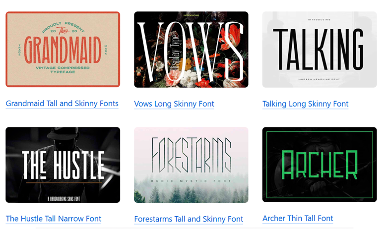
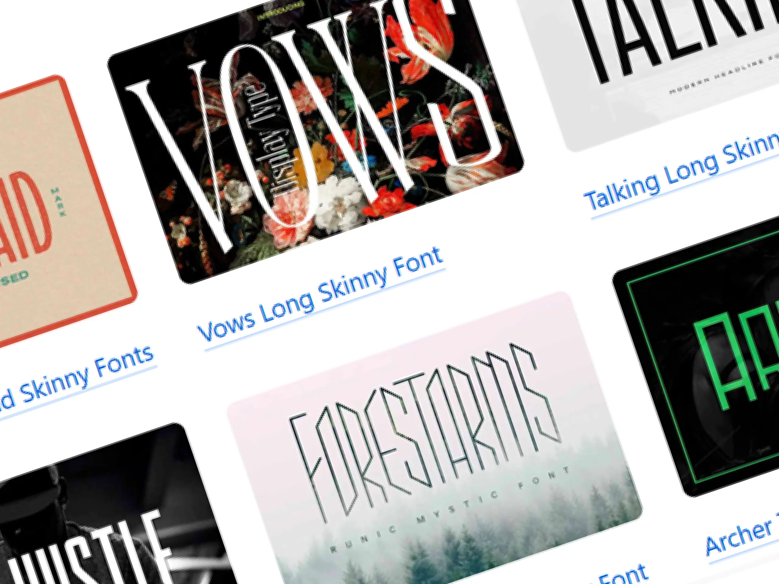
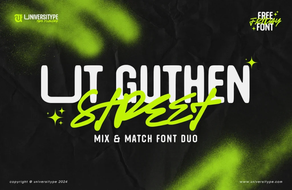
One of the most anticipated trends is the use of sans serifs with elongated, tall lettering. These typefaces, characterized by their vertically stretched proportions, offer a modern and sophisticated look. They are particularly effective in editorial design and branding, where verticality can be used to create a sense of luxury and exclusivity.
Why It Matters: The trend towards elongated lettering aligns with the minimalist aesthetic that continues to dominate design. These fonts make a strong visual impact without overwhelming the viewer, offering a clean, refined look.
Relevant Statistic: According to Monotype’s 2023 Type Trends report, there has been a 25% increase in the use of sans serif fonts with elongated proportions in luxury branding over the past two years.
2. Ultra-Thin Sans Serifs
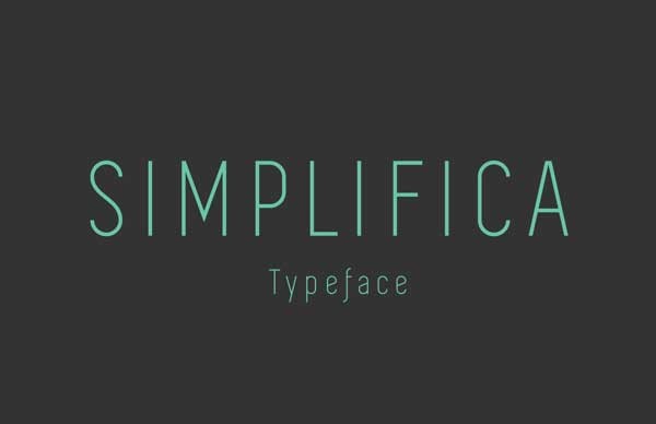
Ultra-thin sans serifs, known for their delicate and airy appearance, are also set to gain traction in 2025. These typefaces, which often feature minimal stroke contrast, are ideal for designs that aim to convey elegance and subtlety. They are particularly popular in the fashion industry, where lightness and sophistication are key visual themes.
Why It Matters: Ultra-thin sans serifs are a response to the desire for understated design. They work well in high-end contexts and can add a touch of class to both digital and print media.
Relevant Statistic: Research by Fontspring indicates that the demand for ultra-thin sans serifs has increased by 18% annually, particularly in digital interfaces where legibility and screen performance are critical.
3. Imperfect Lettering
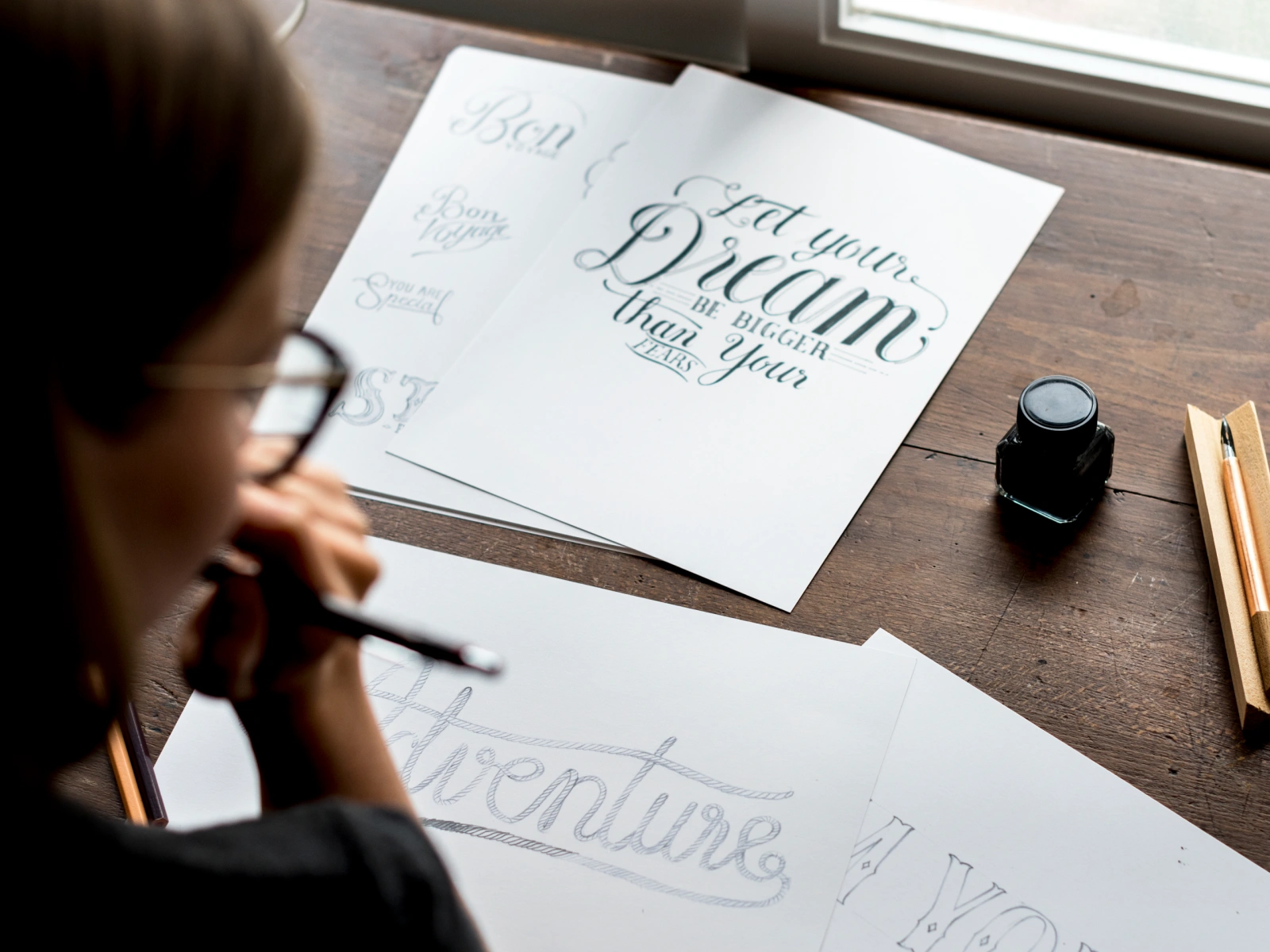
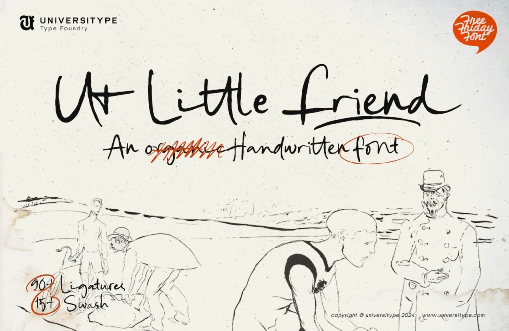
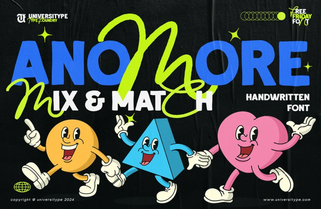
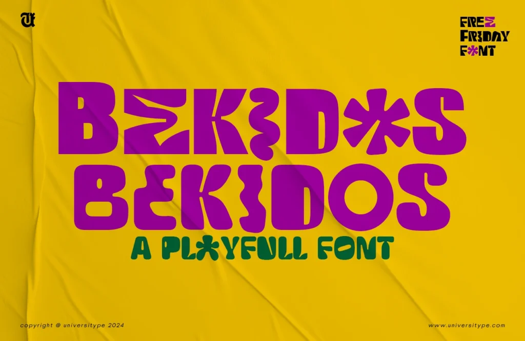
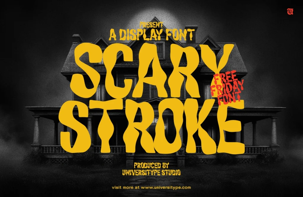
In contrast to the precision of sans serifs, imperfect lettering is becoming increasingly popular. These typefaces embrace irregularities, such as uneven baselines, inconsistent stroke widths, and hand-drawn aesthetics. This trend reflects a shift towards authenticity and individuality in design, where the imperfections of the human touch are celebrated.
Why It Matters: Imperfect lettering adds personality and character to design projects. It’s particularly effective in branding, where conveying a sense of uniqueness and craftsmanship is essential.
Relevant Statistic: A survey by Creative Market found that 40% of designers are incorporating hand-drawn or imperfect typefaces into their work, citing a desire to move away from overly polished digital aesthetics.
4. Unique Decorative Strokes
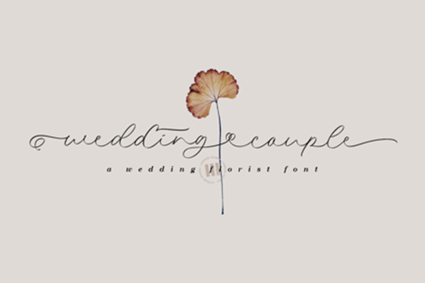
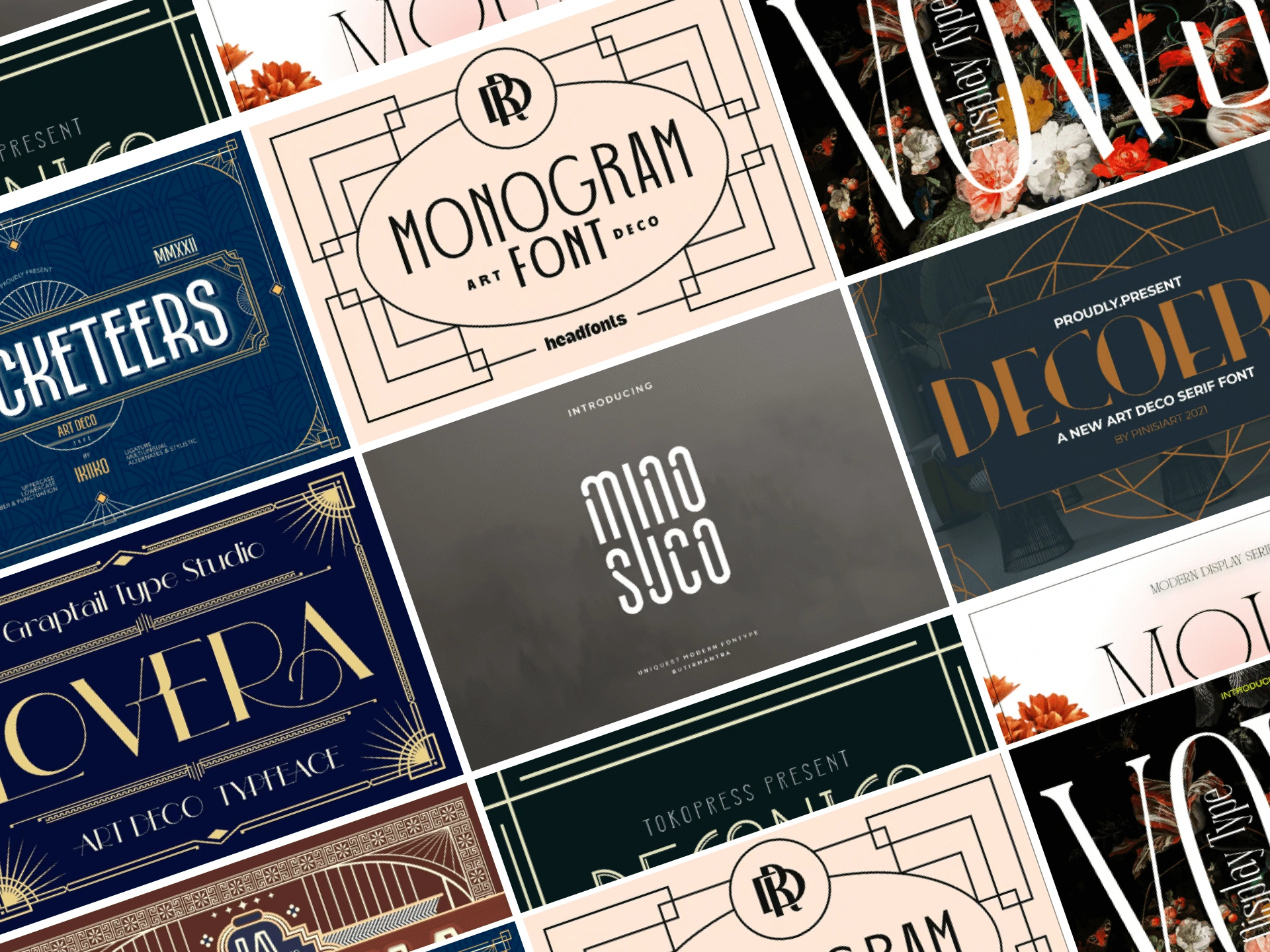
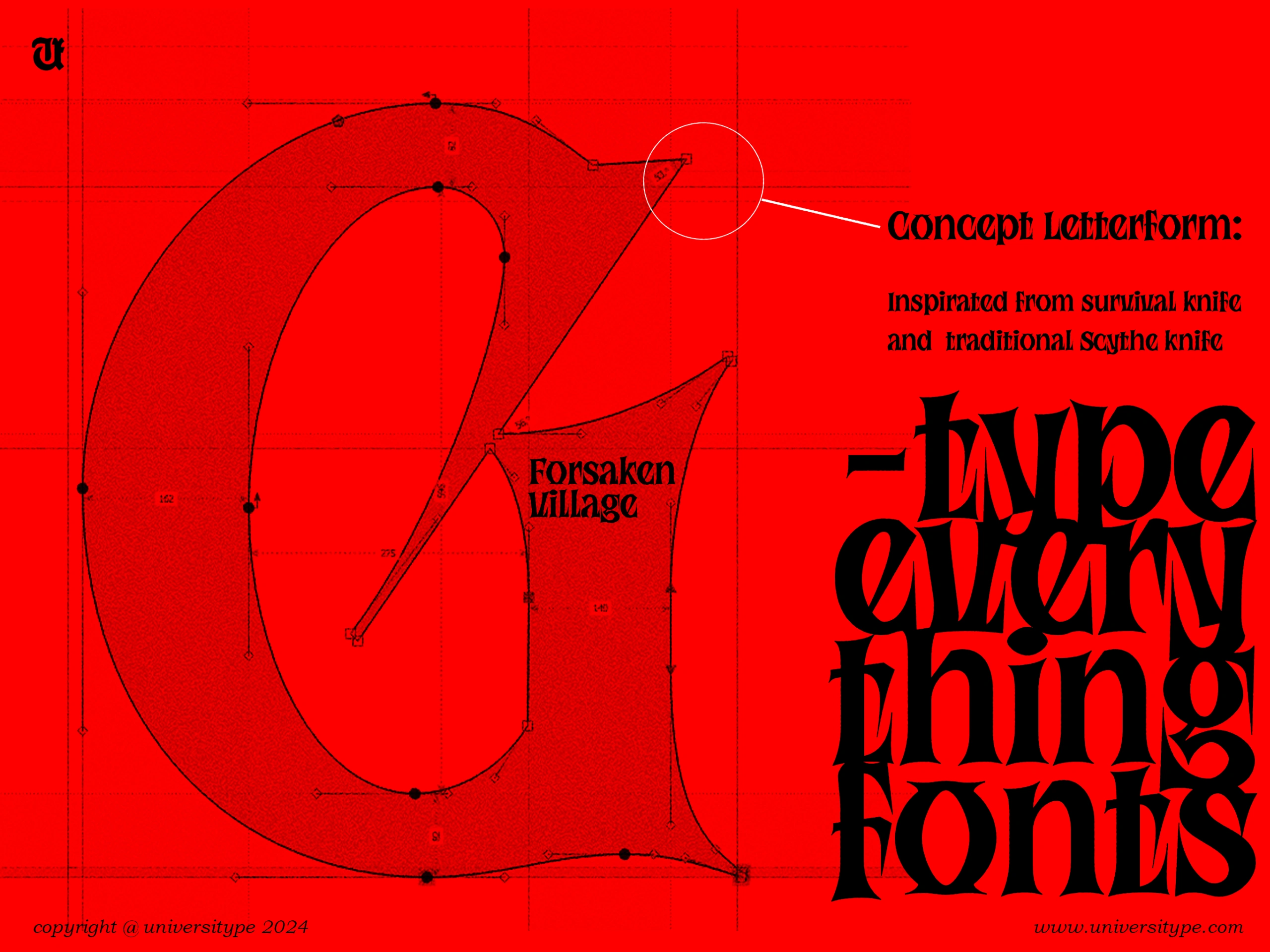
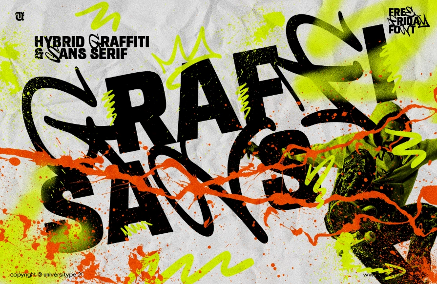
Decorative strokes are making a comeback, with designers experimenting with flourishes, swashes, and intricate details. These unique elements add a layer of ornamentation to typefaces, making them ideal for headlines, logos, and other focal points in a design. The trend is part of a broader move towards maximalism in design, where more is more.
Why It Matters: Decorative strokes offer a way to inject creativity and flair into typography. They allow designers to create standout text elements that draw the eye and add visual interest.
Relevant Statistic: According to Behance, there has been a 30% increase in the popularity of decorative typefaces with unique strokes, particularly in the packaging and advertising sectors.
5. Achieving Impact with Strong Character
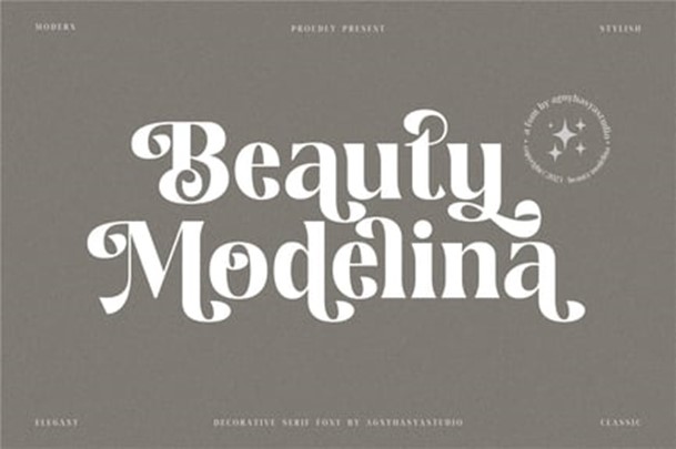
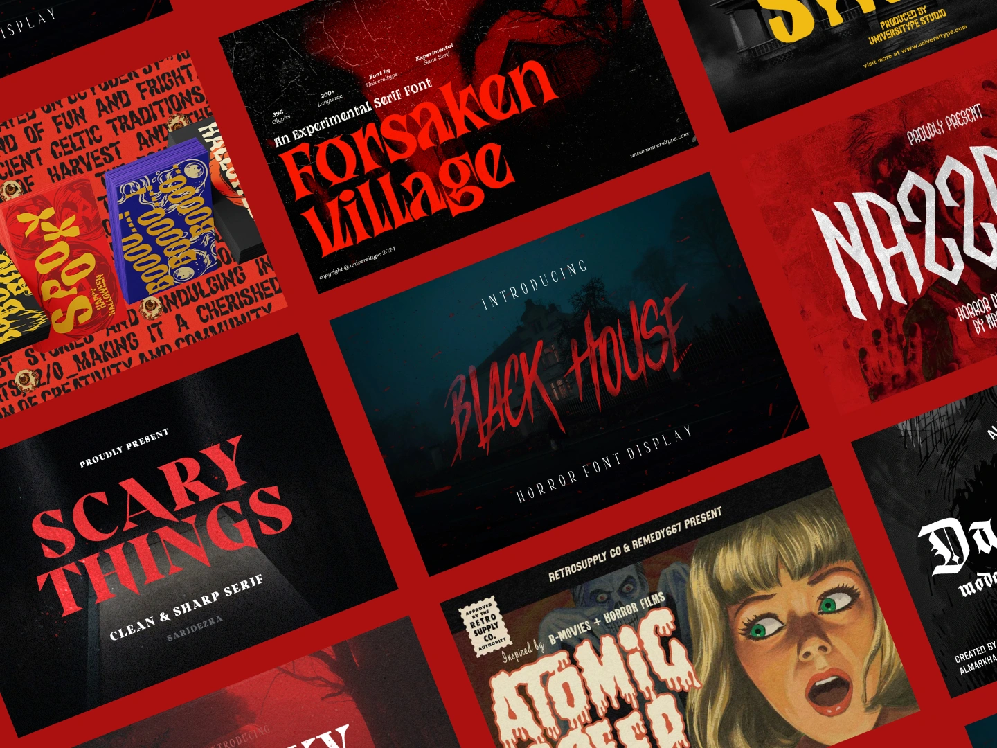
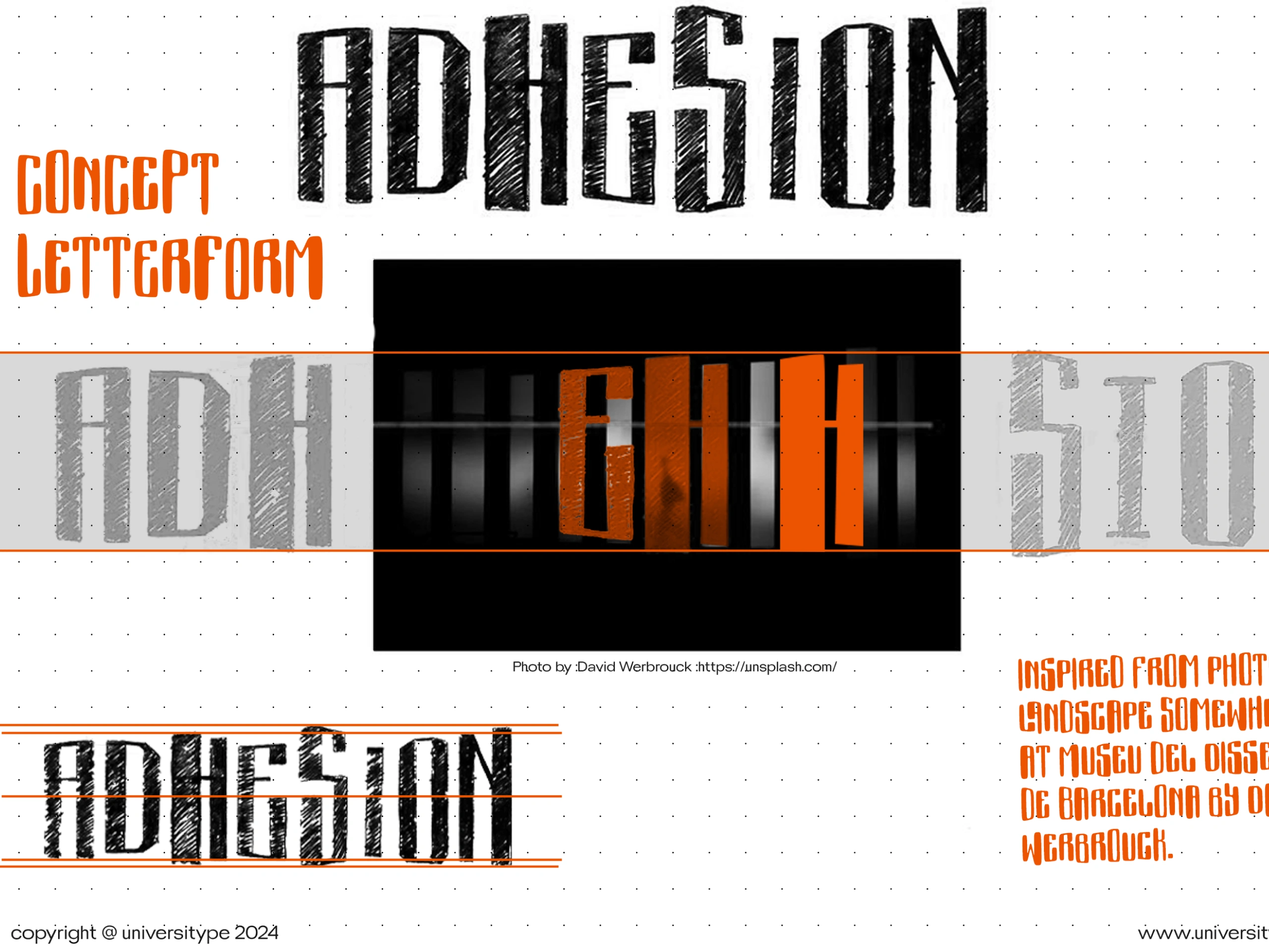
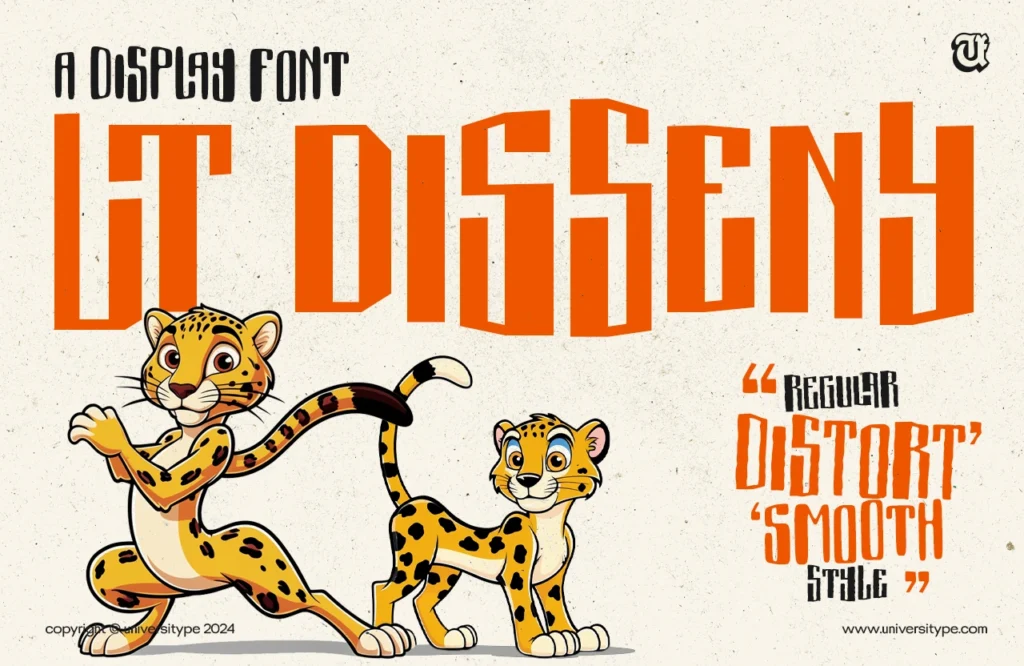
In 2025, typefaces with bold, strong characters will continue to be favored, particularly in branding and advertising. These fonts are designed to make an immediate impact, often featuring heavy weights, condensed proportions, and strong geometric shapes. They are perfect for designs that need to convey confidence and authority.
Why It Matters: Strong character fonts are versatile and highly effective in creating memorable brand identities. Their boldness ensures that the message is communicated clearly and powerfully.
Relevant Statistic: A study by Typewolf revealed that 60% of successful rebrands in 2023 involved the use of bold typefaces, underscoring their importance in modern design.
6. Retro-Futurism in Type
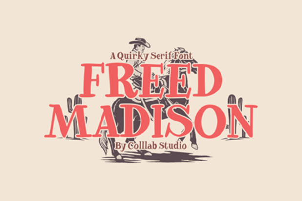
Retro-futurism, a design style that blends futuristic elements with vintage aesthetics, is influencing typography as well. This trend often features typefaces inspired by the sci-fi fonts of the 1970s and 1980s, characterized by geometric shapes, bold lines, and a sense of nostalgia for past visions of the future.
Why It Matters: Retro-futurism resonates with audiences seeking both familiarity and novelty. It’s a way for designers to tap into nostalgia while also pushing the boundaries of contemporary design.
Relevant Statistic: Adobe Fonts reports a 15% increase in the use of retro-futuristic typefaces in digital media, particularly in tech and entertainment industries.
7. Fluid Forms: Variable Fonts Redefine Typography
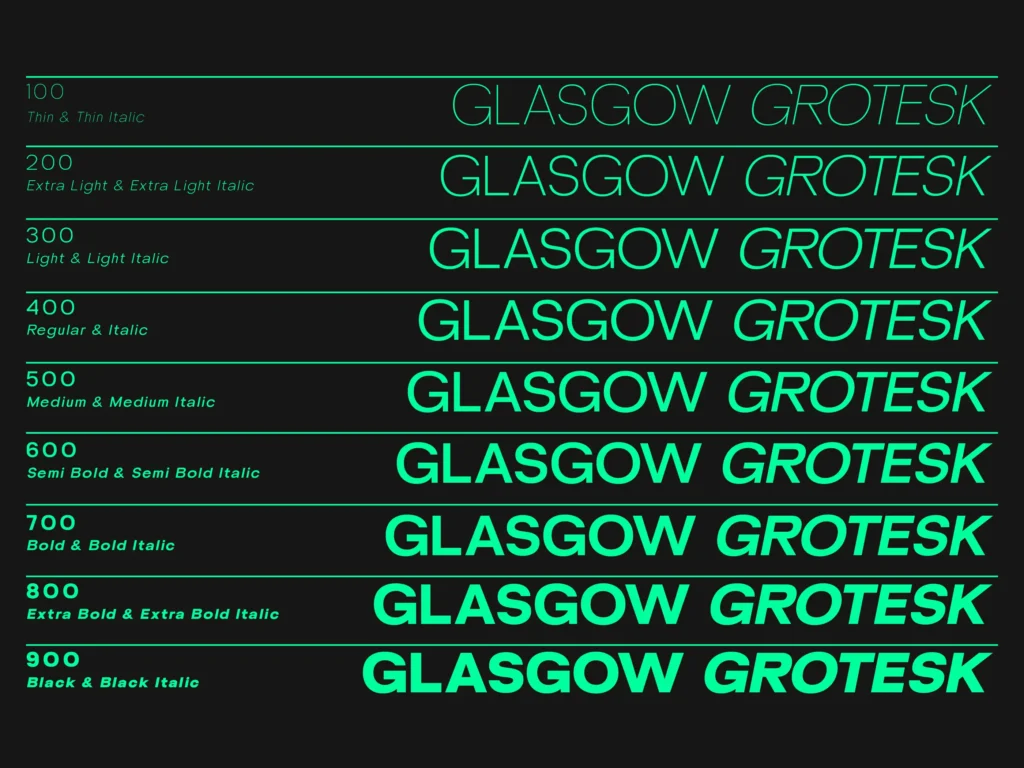
Variable fonts, which allow for dynamic adjustments in weight, width, and other characteristics, are set to redefine typography in 2025. These fonts offer unparalleled flexibility, enabling designers to create responsive text that adapts seamlessly to different screen sizes and contexts.
Why It Matters: Fluid forms in typography are a response to the demands of modern web design, where adaptability and performance are crucial. Variable fonts reduce the need for multiple typefaces, streamlining design processes and enhancing user experience.
Relevant Statistic: According to a Google Fonts report, the use of variable fonts in web design has doubled since 2022, reflecting their growing importance in responsive design.
8. Resurgence of Elegant Serifs
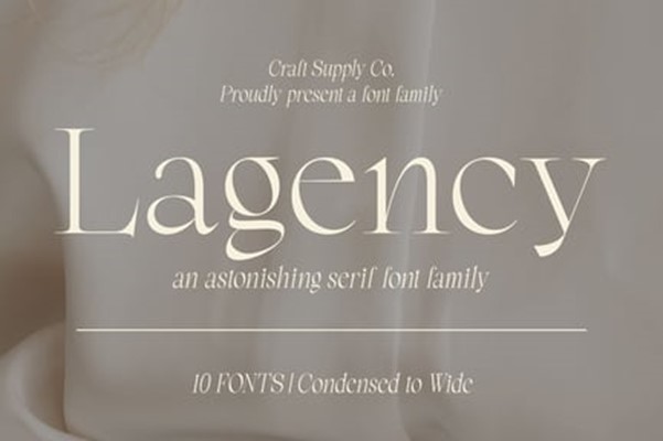
Elegant serifs, with their refined, classic forms, are making a strong comeback. These typefaces, often characterized by high contrast between thick and thin strokes, evoke a sense of tradition and sophistication. They are particularly popular in editorial design, luxury branding, and high-end fashion.
Why It Matters: The resurgence of elegant serifs reflects a desire for timeless beauty in design. These fonts offer a counterbalance to the minimalism of sans serifs, providing a touch of elegance and tradition.
Relevant Statistic: A report by Typographica notes a 20% increase in the use of serif typefaces in branding and editorial projects, particularly in the luxury sector.
Conclusion
The typography trends anticipated for 2025 highlight a diverse range of styles, from the minimalist elegance of ultra-thin sans serifs to the bold impact of strong character typefaces. Designers are increasingly embracing both the precision of modern technology and the imperfections of human touch, creating a rich, multifaceted landscape in which typography plays a central role.
As we move forward, it will be fascinating to see how these trends evolve, influenced by cultural shifts, technological advancements, and the ever-changing tastes of consumers. For designers, staying ahead of these trends will be key to creating work that resonates in 2025 and beyond.
Sources
1. Monotype’s 2023 Type Trends report
2. Fontspring
4. Behance
5. Typewolf
6. Adobe Fonts
7. Google Fonts
8. Typographica

