In the digital age, typography plays a crucial role in website design and user experience. The art and science of arranging and selecting fonts can significantly enhance the readability of online content. This article will provide typographic tips to help you create visually appealing and highly readable websites.
Understanding Typography
Typography is the art and technique of designing typefaces and arranging them in text. It has a rich history, spanning from the printing press to modern-day digital displays. Mastering typography is essential for crafting aesthetically pleasing and functional content for the web.
The key elements of typography include typefaces, font sizes, character spacing (kerning), line spacing (leading), and word spacing (tracking). Typefaces can be broadly categorized as serif (e.g., Times New Roman) or sans-serif (e.g., Arial), each conveying a distinct tone and personality. Choosing the right typeface is crucial for ensuring readability and visual harmony.
Typographic Best Practices
- Typeface Selection: Opt for clean, legible typefaces for body text, such as sans-serif fonts like Open Sans or Arial. Reserve more decorative or script fonts for headings and accents, using them sparingly to avoid compromising readability.
- Font Size: For body text, a standard font size of 16 pixels is generally recommended for optimal readability. Use larger font sizes for headings to create a clear hierarchical structure and help readers navigate the content.
- Spacing and Alignment: Proper kerning, leading, and tracking enhance the overall readability of your text. Ensure adequate spacing between characters, lines, and words to prevent the text from appearing too cramped or too loose.
- Emphasis: Use bold, italics, or underlining judiciously to draw attention to critical information. Overuse of these techniques can distract the reader, so reserve them for the most important elements.
- Typographic Hierarchy: Establish a clear hierarchy using heading styles (H1, H2, H3, etc.) to organize your content and make it easier for readers to navigate and identify key sections.
- Consistency: Maintain a consistent typographic style throughout your website by using a limited number of complementary typefaces and applying consistent sizing, spacing, and formatting.
- Contrast: Ensure sufficient contrast between the text and the background to enhance readability. Dark text on a light background or light text on a dark background are generally the most legible combinations.
Practical Tips for Beginners
- Choose Proven Typefaces: For a solid foundation, opt for well-established and highly readable typefaces, such as Open Sans, Georgia, or Arial.
- Utilize Design Tools: Take advantage of font libraries like Adobe Fonts or Google Fonts, which often provide recommendations for optimal font usage and sizing.
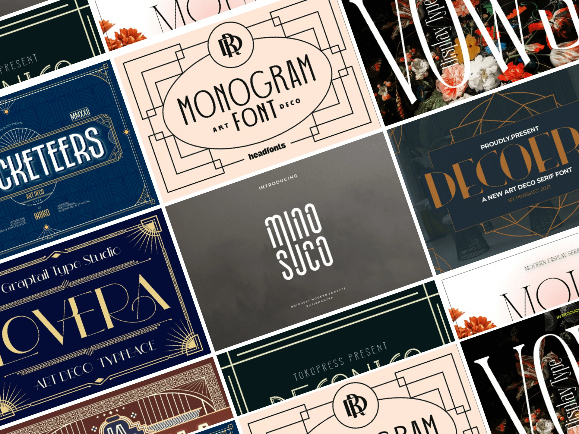
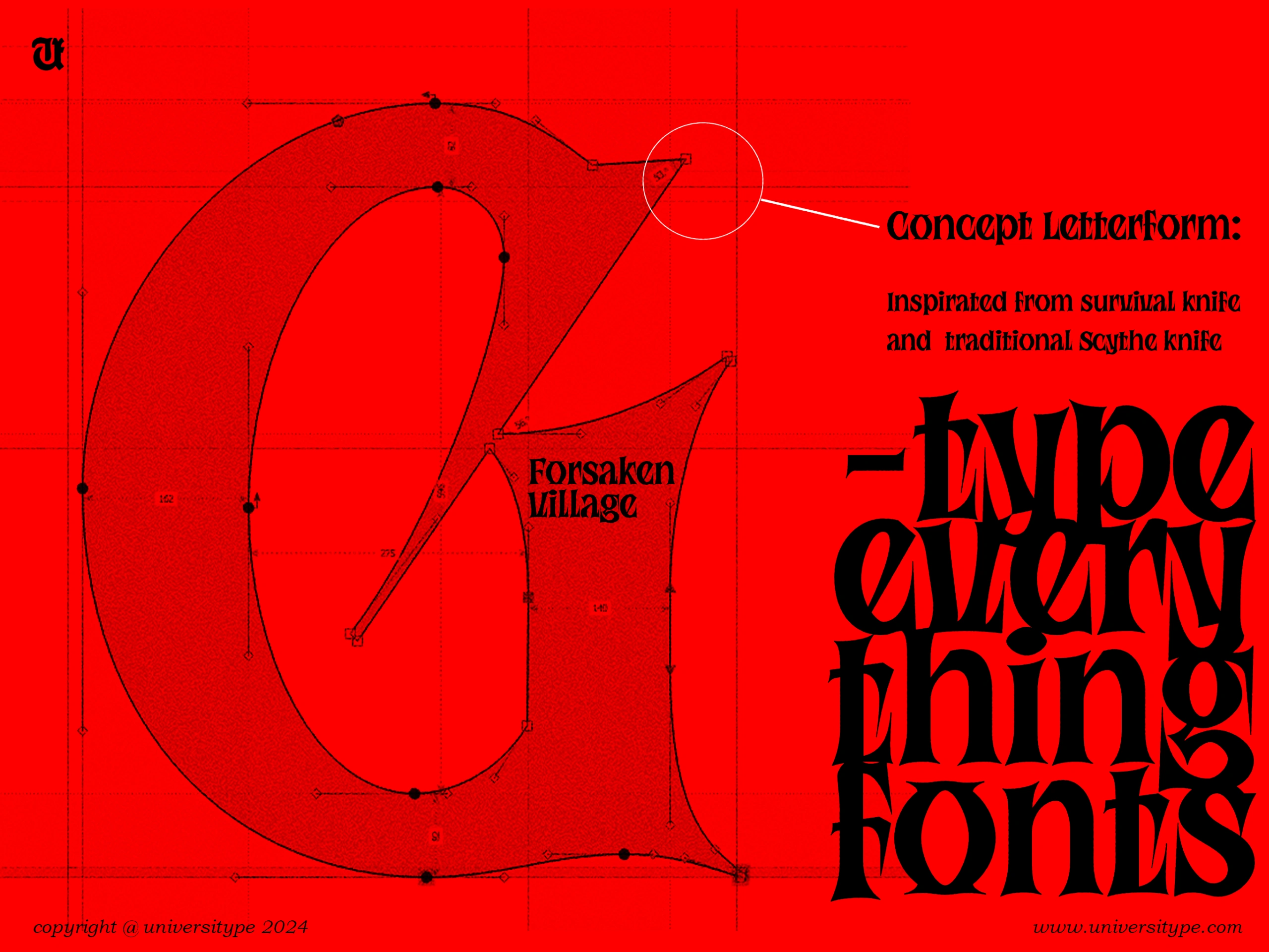
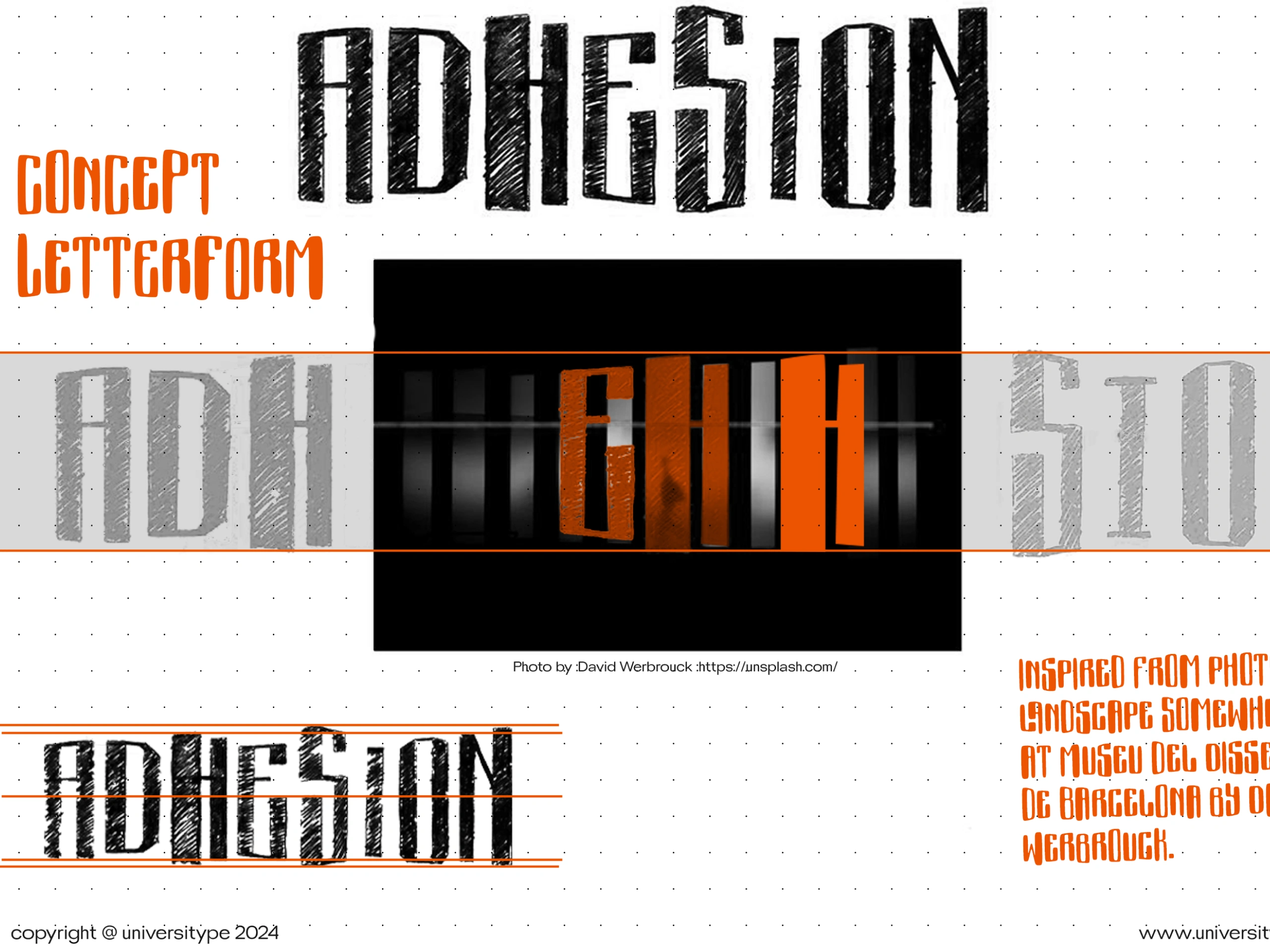
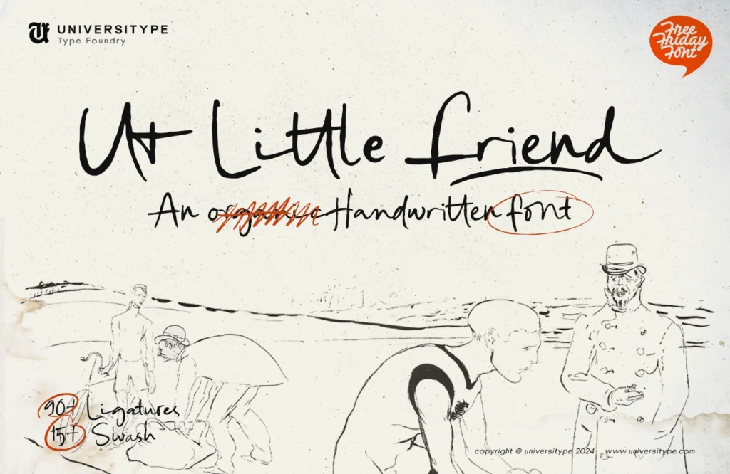
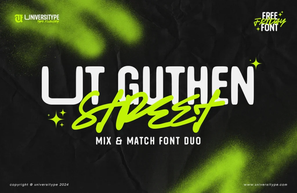
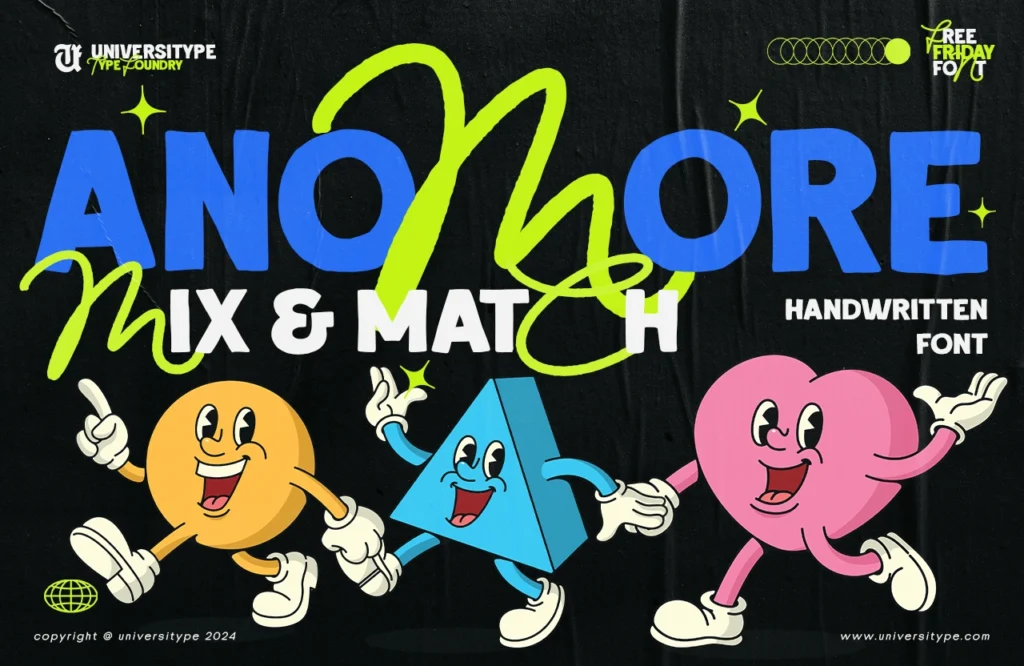
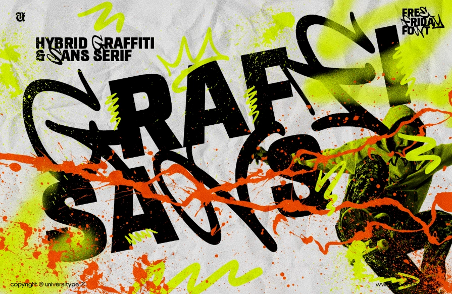
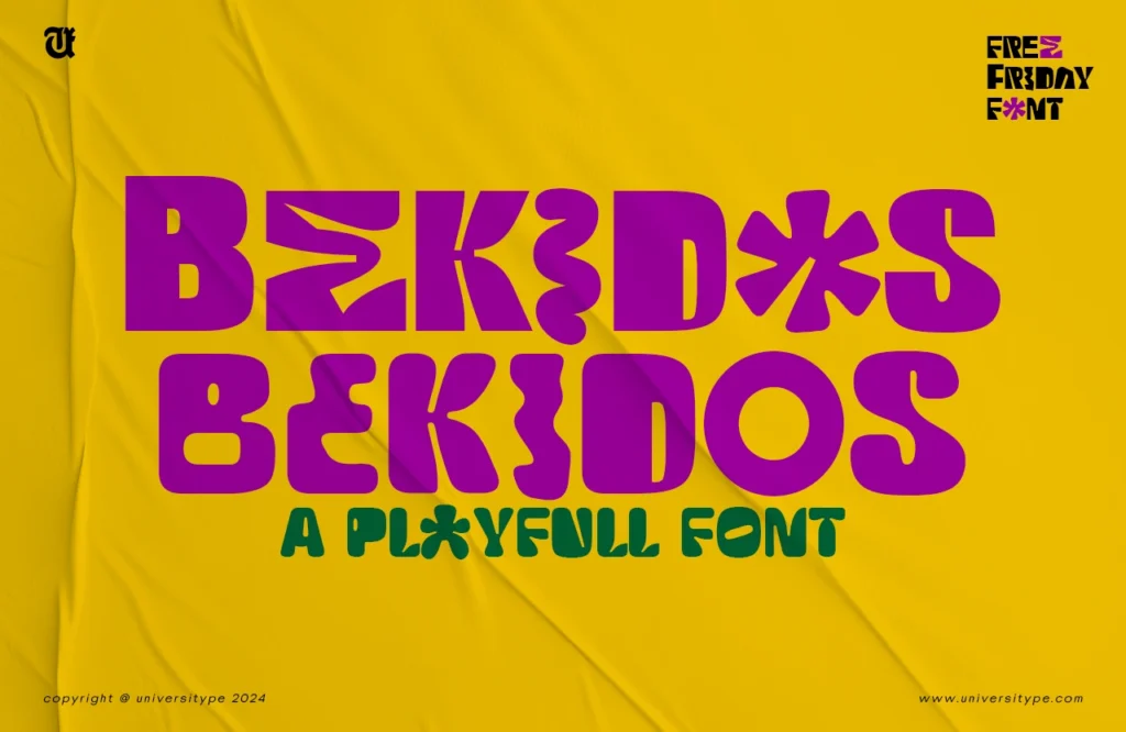
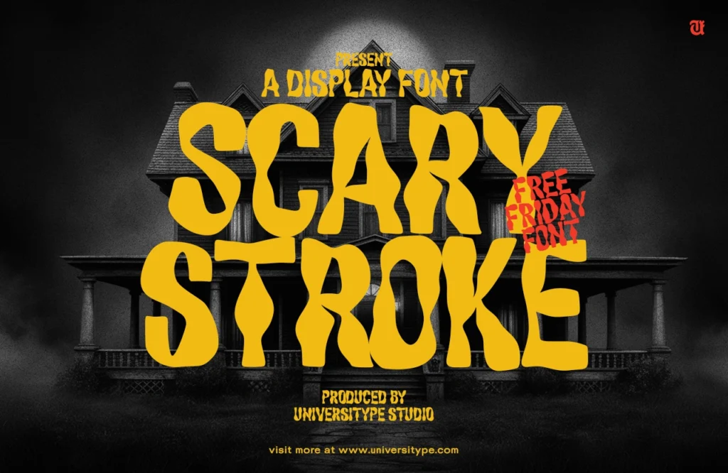
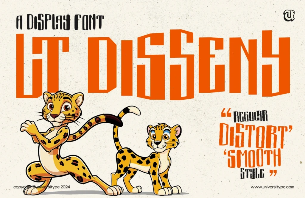
- Learn from Exemplary Designs: Analyze the typography used in well-designed websites to gain inspiration and insights into effective typographic principles, see universitype fonts for example.
- Practice and Experiment: Typography is an art form that requires continuous practice and experimentation. Explore different font combinations, sizes, and layouts to develop a better understanding of their impact on readability and aesthetics.
Common Typographic Errors to Avoid
- Excessive Font Variety: Limit the number of font styles used on your website, typically no more than two or three complementary typefaces, to maintain a cohesive and easily readable design.
- Inappropriate Font Choices: Avoid using ornate or decorative fonts for body text, as they can compromise readability. Reserve these types of fonts for headings or accents.
- Inconsistent Formatting: Ensure consistent sizing, spacing, and styling throughout your website to create a visually harmonious and easy-to-navigate user experience.
By implementing these typographic best practices, you can create online content that is not only visually appealing but also highly readable and engaging for your audience.


