Choosing the right font is an art that requires sensitivity and knowledge of typography. The right font can strengthen the message, influence the mood, and improve readability. However, with thousands of fonts available, choosing which one suits you best can be a challenge. Here are tips and tricks from typographers to help you choose the right font for your project.
1. Consider your design purpose.
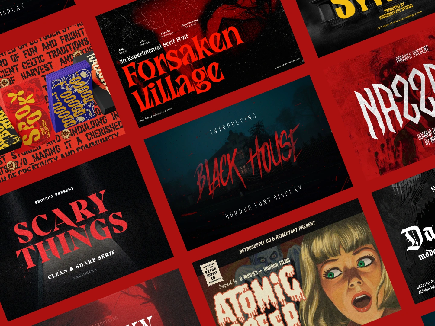
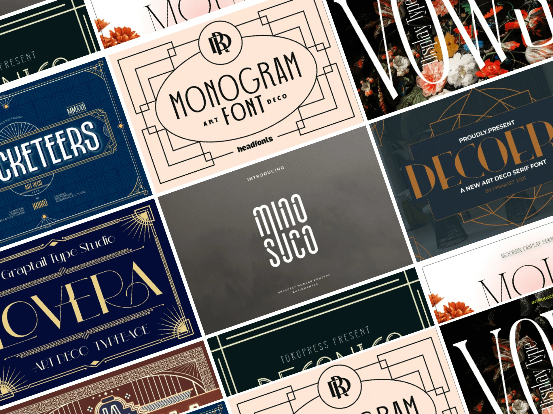
Before choosing a font, consider your design purposes. Do you make promotional posters, websites, books, or wedding invitations? The type of project will affect the type of font you have to choose. For example, sans-serif fonts such as Arial or Helvetica are more suitable for modern web design, while serif fonts like Times New Roman are better suited for long text such as books.
2. Know your audiences.
Knowing who will see your design is crucial when choosing fonts. Younger audiences may prefer modern and bold fonts, while older audiences may be more comfortable with more traditional and easy-to-read fonts. Always think of the preferences and needs of your audience.
3. Note Readability
Readability is the key to typography. Excessively decorative or complicated fonts may appear interesting but can be difficult to read in long text. Make sure that the font you choose is easy-to-read in various sizes and on a variety of devices, especially if used for body text.
4. Use Typography Hierarchy
Typography hierarchy helps organize information and guide readers through content. Use size, weight, and style variations to create clear hierarchies. Main headers can use larger and thicker fonts, while subheaders and body texts can use smaller sizes and weights.
5. Combine fonts smartly.
Combining two or more fonts can create dynamic and engaging designs. However, avoid using too many different fonts, as they can make the design look messy. As a general rule, choose one font for the title and another for the body text. Make sure the fonts complement each other and do not conflict with each other.
6. Note Contrasts
Contrasts between fonts can help highlight important information and make it easier to read. Use contrast in size, weight, and style to create a clear distinction between text elements. Make sure there is also enough contrast between text and background to improve readability.
7. Customize branding
If you are working on a project related to a particular brand, make sure that the font you choose corresponds to the brand identity. Fonts must be consistent with the brand style and image and used consistently in all branding materials.
8. Test fonts in real context.
Before deciding on fonts, test them in the actual design context. Print your designs or view them on the screen in a variety of sizes to ensure legibility and compatibility. Note how fonts look in long paragraphs, titles, and other elements.
9. Use the correct license font.
Make sure you have permission to use the font you choose. Some fonts are free for personal use but require a license for commercial use. Read and understand the font license before using it in your project.
10. Keep open to experiments.
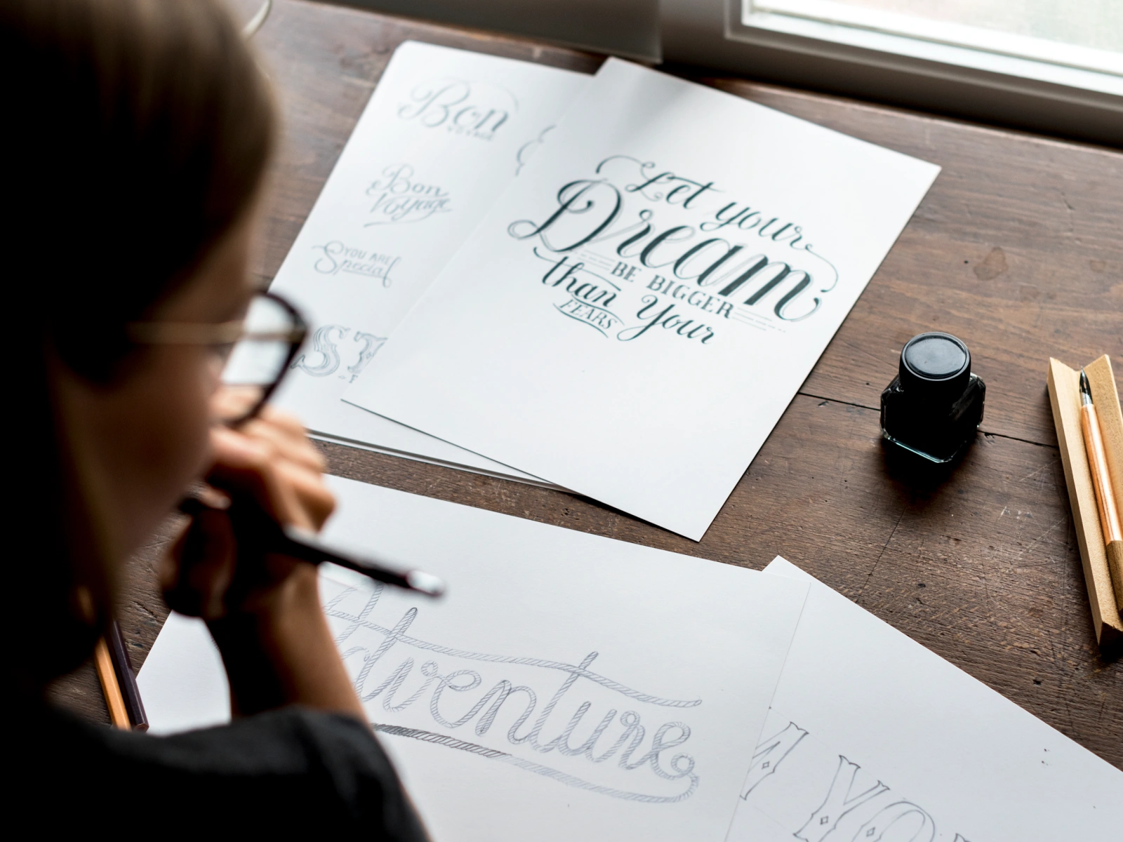
Don’t be afraid to experiment with different fonts. Try different combinations and see which fits your design best. Experiments can produce unique and exciting font combinations.
Conclusion
Choosing the right font is an important part of the design process. By considering the design objectives, audiences, readability, and other factors, you can choose a font that reinforces your message and improves the overall appearance of your design. Remember to always test the font in a real context and remain open to experimentation. With a little practice and sensitivity, you will be able to choose the correct font with confidence.


