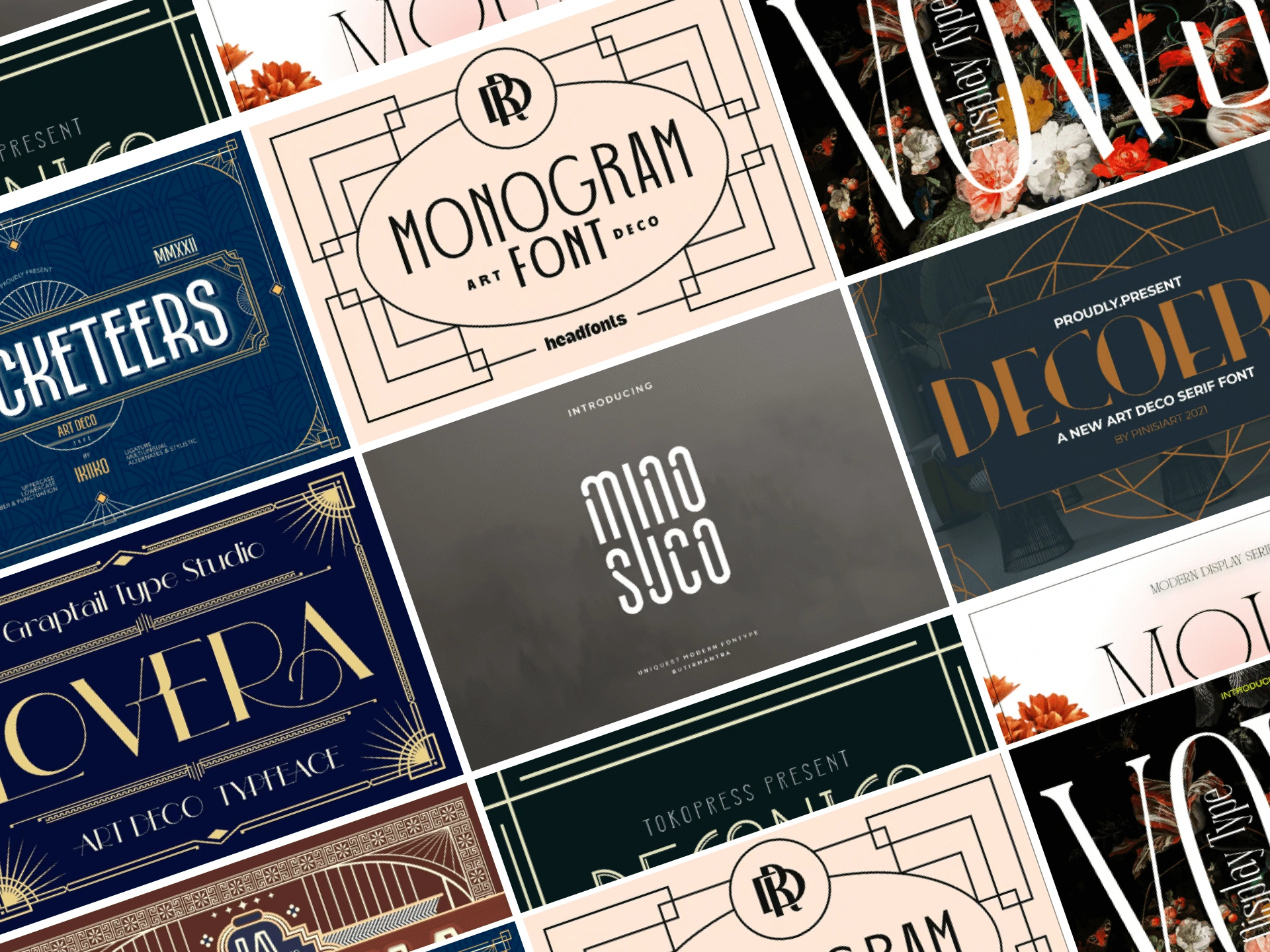
Art Deco typography is a captivating blend of elegance and functionality. Born in the 1920s, it reflects an era of optimism and progress.
This style is known for its geometric shapes and clean lines. It’s a testament to the influence of cultural movements like Cubism and Futurism on design.
Art Deco fonts, such as Broadway and Metropolis, have left a lasting impact. They continue to inspire modern design and branding with their timeless appeal.
In this guide, we delve into the world of Art Deco typography. We’ll explore its history, characteristics, and its enduring influence on the design landscape.
The Birth of Art Deco Typography
Art Deco typography emerged in the 1920s. It was a time of cultural and technological advancements.
This style was popularized globally by the Paris Exposition of 1925. The exposition showcased the elegance and modernity of Art Deco design.
Art Deco typography was heavily influenced by Cubism and Futurism. These movements emphasized geometric shapes and symmetry.
The style quickly gained traction. It became a symbol of luxury and modernity, reflecting the societal optimism of the era.
Defining Characteristics of Art Deco Fonts
Art Deco fonts are known for their geometric shapes. They often feature clean lines and symmetry, creating a sleek and modern look.
These fonts also use high contrast and metal tones. This gives them a luxurious and elegant feel.
Art Deco typography is functional yet ornate. It strikes a balance between simplicity and intricate details.
Here are some key characteristics of Art Deco fonts:
- Geometric shapes
- Symmetry
- Clean lines
- High contrast
- Metal tones
Iconic Art Deco Fonts of the 1920s
The 1920s saw the birth of many iconic Art Deco fonts. Broadway, Bifur, and Metropolis are just a few examples.
Broadway is a font that embodies the glitz and glamour of the era. It’s often used in theatre and film.
Bifur, on the other hand, is known for its geometric design. It’s a perfect example of the Art Deco style.
Metropolis is another popular choice. It’s a versatile font that works well in both print and digital media.
Art Deco Typography in Modern Design
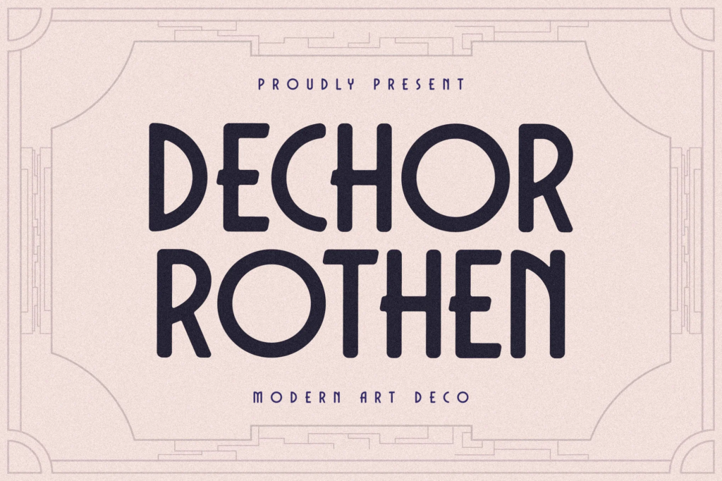
Art Deco typography has made a resurgence in modern design. Its elegance and symmetry are appreciated by many designers.
Brands often use Art Deco fonts to convey luxury and modernity. They are a popular choice for logos and packaging.
The film industry also frequently uses Art Deco typography. It’s particularly common in movie posters.
Digital design tools have made it easier to incorporate Art Deco styles. This has further increased their popularity.
Selecting and Using Art Deco Fonts Today
Choosing the right Art Deco font can greatly enhance a design project. It’s important to consider the context and purpose of the design.
Art Deco fonts are versatile. They work well in both digital and print media.
Here are a few tips for using Art Deco fonts:
- Ensure the font is legible and readable.
- Consider the psychological impact on viewers.
- Be aware of licensing and legal considerations.
- Use digital design tools to adapt the typography to your needs.
Art Deco typography can create a unique, vintage aesthetic. It’s a timeless style that continues to inspire designers today.
Conclusion
Art Deco typography, with its elegance and modernity, has a timeless appeal. It continues to influence contemporary design, from branding to architecture.
Its enduring popularity is a testament to its versatility and unique aesthetic. Art Deco typography is truly a design element that transcends time.

