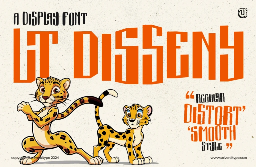
Typography is the art and technique of typesetting to make writing not only legible, but also visually appealing. In the world of graphic design and visual communication, typography plays an important role because it affects how messages are conveyed and received by the audience. For beginners, understanding the basics of typography is a crucial first step. Here is a guide to typography basics for beginners.
Typeface and Fonts
Although often used interchangeably, “typeface” and “font” have differences. A typeface refers to a design family of letters, such as Arial, Times New Roman, or Helvetica. A font, on the other hand, is a specific version of that typeface, e.g. Arial Bold or Times New Roman Italic.
Typeface Categories
Typefaces can be divided into several main categories:
- Serif: This typeface has a small line at the end of the letters. Examples: Times New Roman, Garamond.
- Sans-Serif: Does not have a small line at the end of the letters. Examples: Arial, Helvetica.
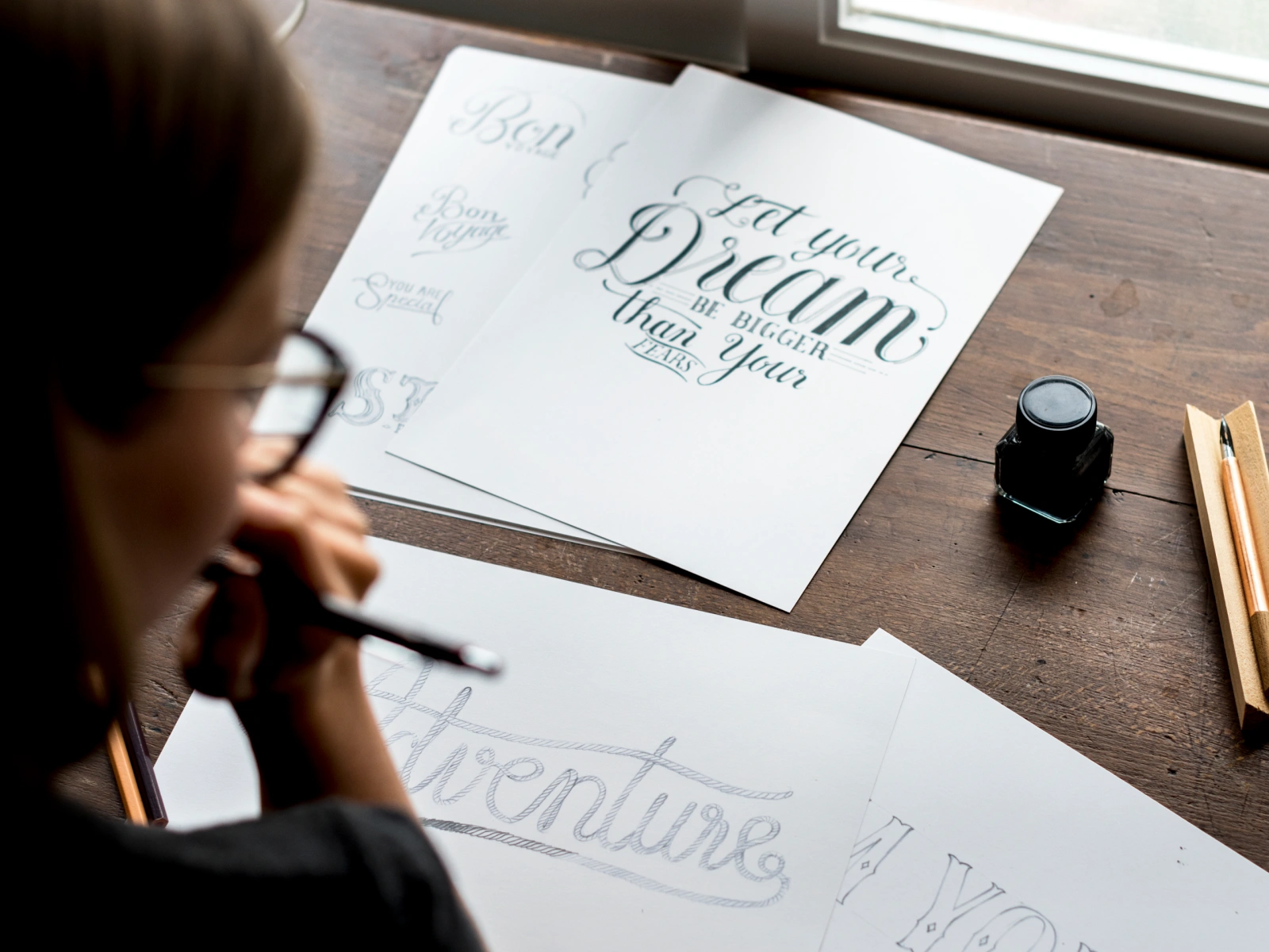
- Script: Resembles handwriting. Example: Brush Script, Pacifico.
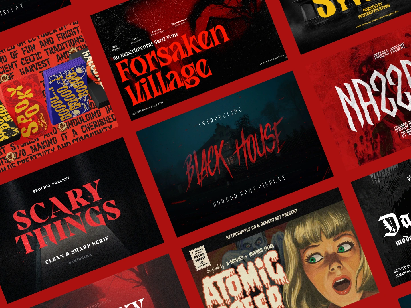
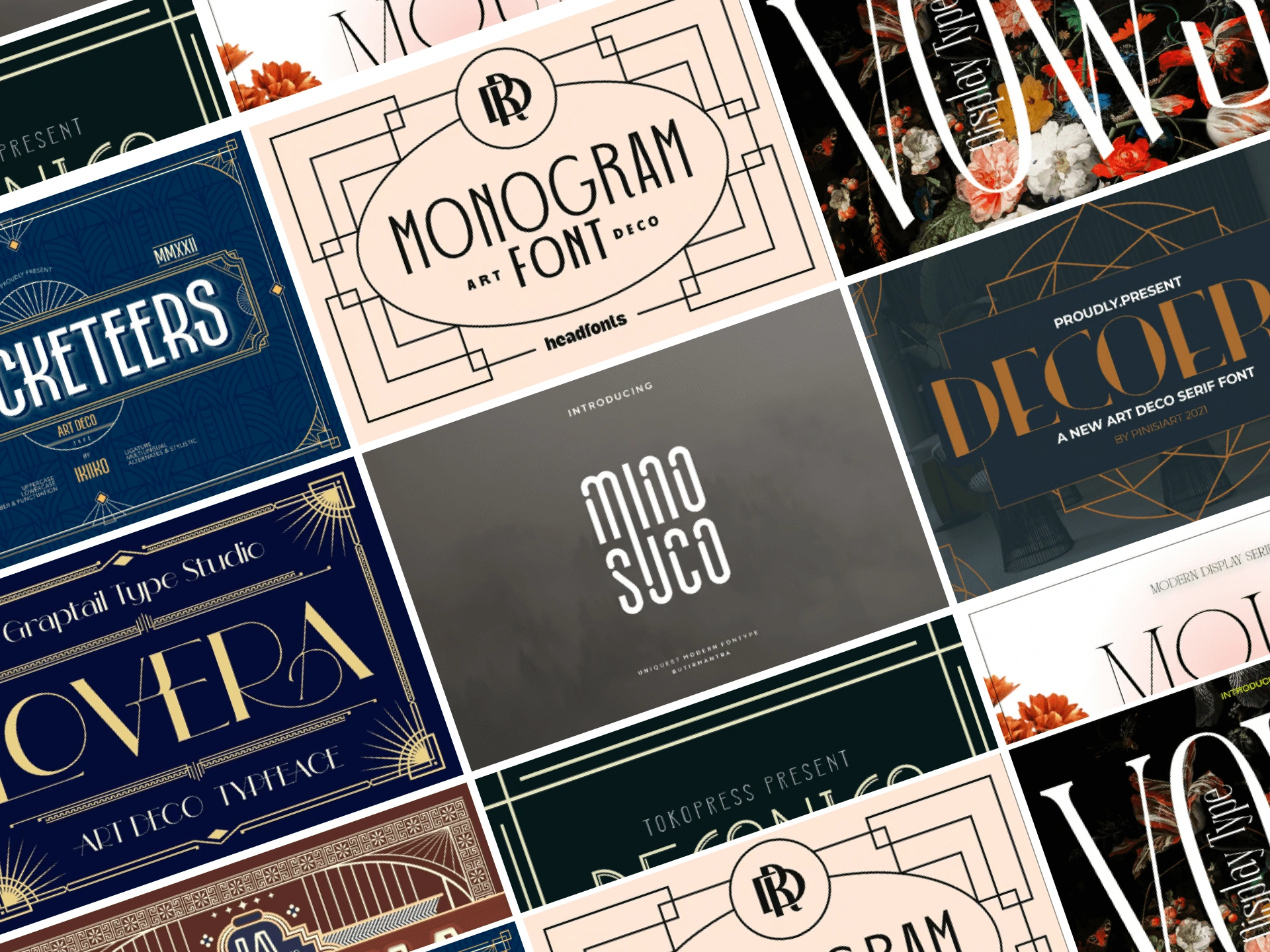
- Display: Designed to be used in large sizes, such as on titles or posters. Examples: Impact, Comic Sans.
Font Size
Font size is measured in points (pt). Generally, body text is sized between 10-12 pt for optimal readability. Larger font sizes are used for headings and subheading.
Kerning, Leading and Tracking
- Kerning: The distance between two individual characters. Setting the kerning helps ensure consistent spacing between letters.
- Leading: The vertical distance between lines of text. Good leading makes it easy for readers to follow the text from one line to the next.
- Tracking: The distance between letters in a word or sentence. Adjusting tracking can make the text tighter or looser.
Hierarchy of Typography
Typographic hierarchy is a way to show the level of importance of text elements. This can be achieved through variations in size, weight, color, and typeface. Main headlines are usually larger and flashy, while subheadlines and body text are smaller and simpler.
Contrast
Contrast in typography means a clear distinction between one text element and another. Contrast can be created through different size, color, weight, or typeface. Good contrast helps highlight important information and makes the text more interesting.
Readability and Clarity
The main goal of typography is to make the text easy to read. Choose a typeface that is clear and large enough in size. Avoid using too many fonts in one design as it can make the text hard to read and look cluttered.
Consistency
Consistency is key in typography. Use the same typeface, size, and style for similar elements. Consistency helps create a professional look and is easy for the reader to follow.
Use of Color
Color in typography can add dimension and help direct attention. Make sure the color contrast between the text and the background is high enough to make the text easy to read. Use color wisely to highlight important information or create a certain atmosphere.
Practice and Experiment
Like any other art, becoming proficient in typography takes time and practice. Don’t be afraid to experiment with different fonts, sizes, and layouts. Notice how small changes can affect the overall design.
Conclusion
Understanding the basics of typography is the first step to becoming a better designer. By mastering basic elements such as typeface, size, kerning, leading, and tracking, you can create designs that are not only visually appealing, but also easy to read and understand. Keep learning and practicing, and you’ll find that typography is a powerful tool in visual communication.
Hopefully, this guide has helped you understand the basics of typography. Have fun creating!

