NEW RELEASED FONT ! - UT BOLDONSE | GET IT HERE
Unlock 30% OFF on all fonts with code UTDECA !

Asobu Architect Firm

Branding, Custom Typeface, Logo Design, Web Design
Overview

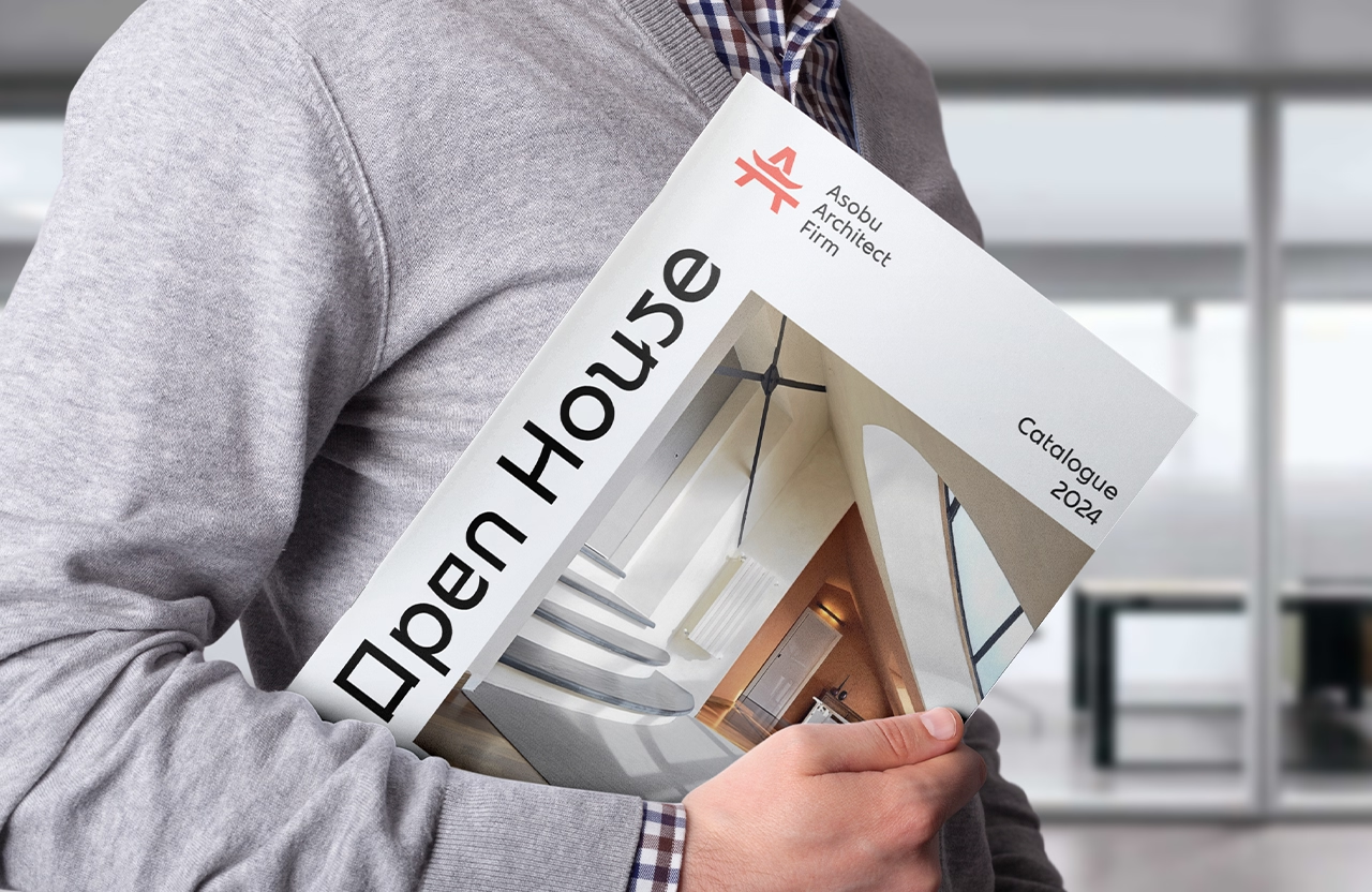
Asobu Studio specializes in creating modern residential and commercial spaces inspired by traditional Japanese design. Meaning “to play or enjoy” in Japanese, “Asobu” reflects the studio’s mission of fostering serene, engaging spaces that invite people to connect deeply with their surroundings. Embracing natural materials, clean lines, and a thoughtful blend of indoor and outdoor elements, Asobu Studio reimagines Japanese architectural principles for today’s lifestyles.

Project Info

Asobu Studio, a design firm specializing in modern residential and commercial spaces inspired by traditional Japanese aesthetics, is facing challenges in building a brand identity that connects with its audience. While their mission and vision are clear, their current visual identity lacks the strength to effectively communicate the studio’s unique blend of tradition and modernity. This has led to confusion among potential clients and limited recognition in a crowded market.

To help Asobu Studio stand out, the goal is to craft a thoughtful and cohesive brand identity that embodies their core philosophy of balancing heritage with contemporary design. This process will involve:

  • Research: Deeply exploring Japanese design principles and their relevance in modern architecture and interiors.
  • Translation: Converting Asobu Studio’s values into visual elements that communicate tranquility, precision, and craftsmanship.
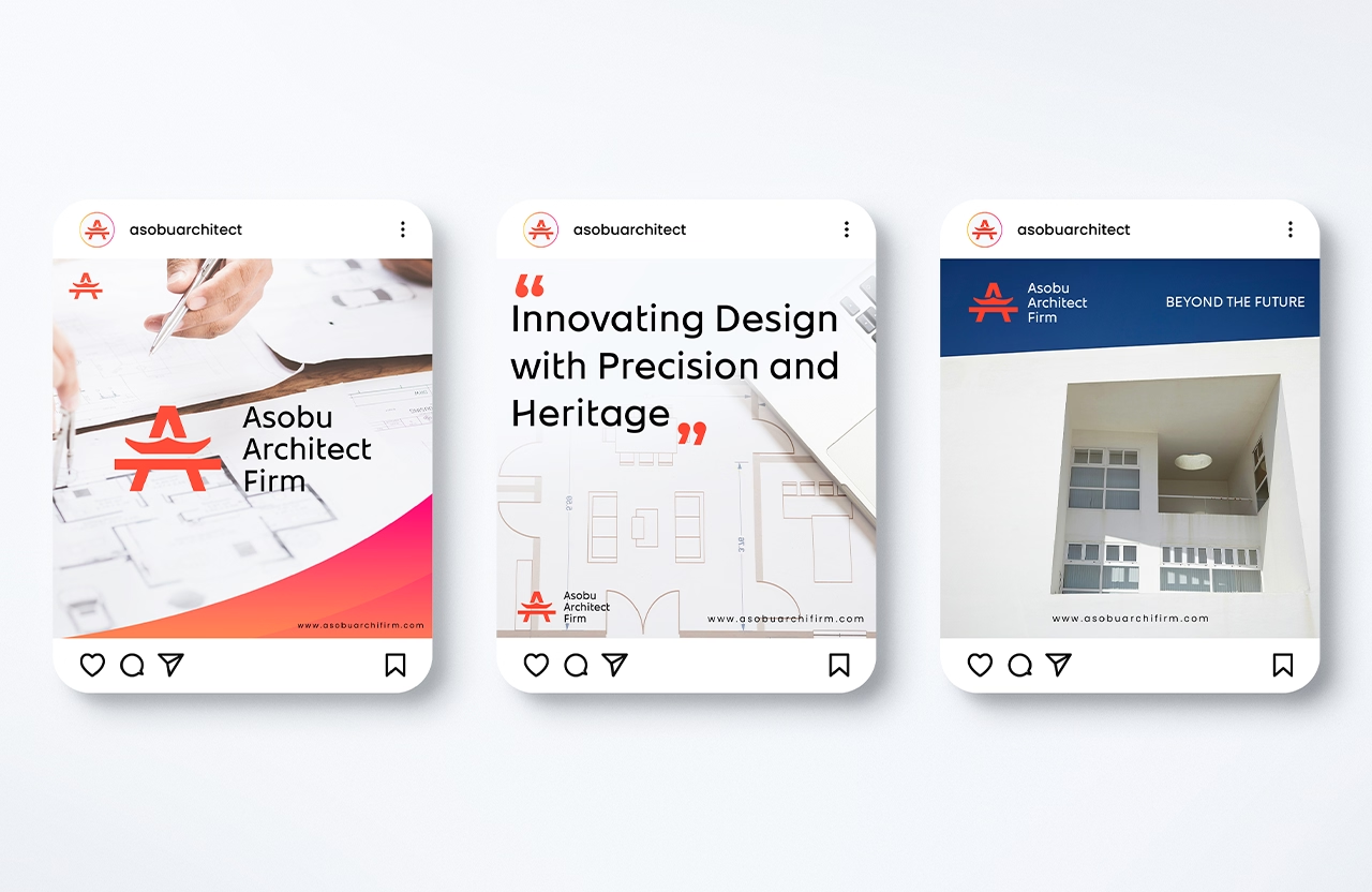
  • Execution: Building a consistent and versatile brand system that resonates across both digital and physical platforms.

The reimagined brand identity for Asobu Studio will consist of:

Logo

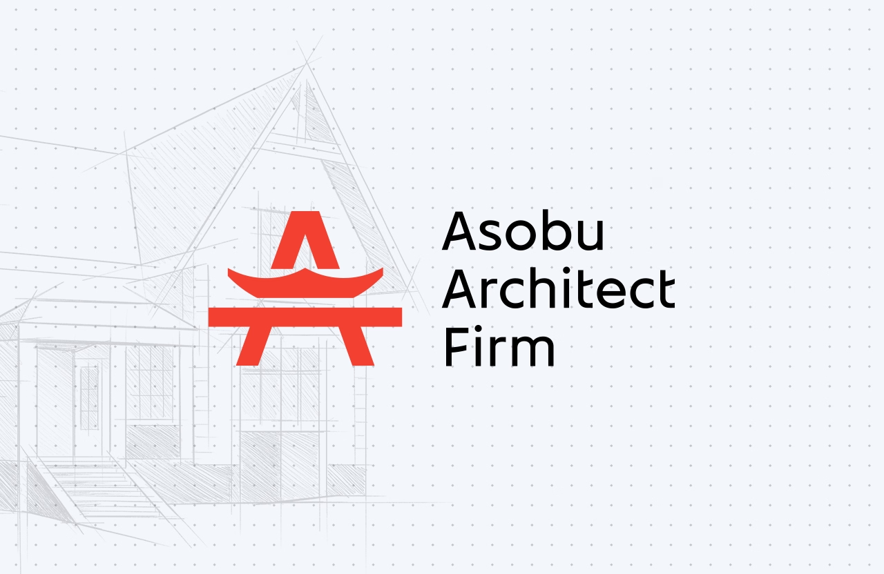
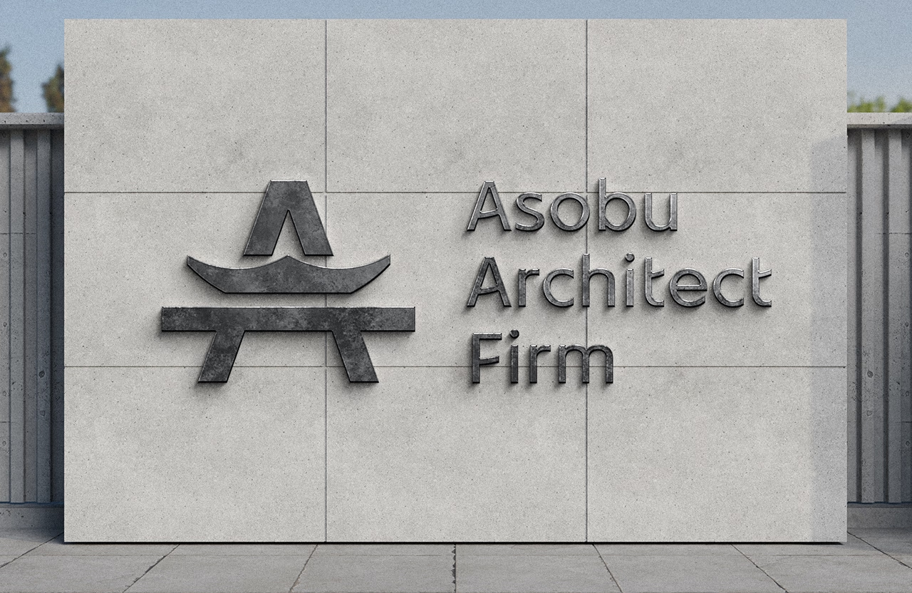
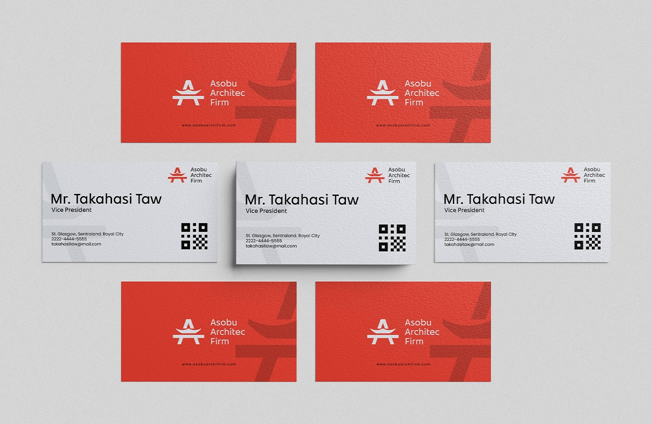
A minimalist emblem inspired by iconic Japanese symbols like the torii gate and traditional architectural forms. The design will embody serenity, strength, and precision, echoing the studio’s philosophy.

Custom Typeface

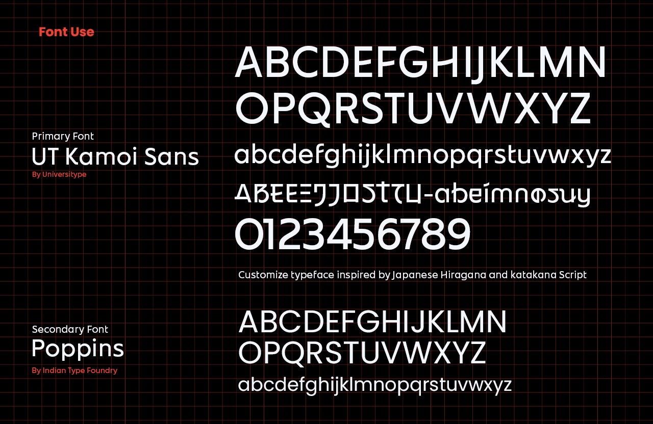
A bespoke typeface designed with clean, contemporary lines and subtle organic curves. This typeface will seamlessly blend modern design sensibilities with a nod to traditional Japanese artistry.

Color Palette

A harmonious mix of neutral, earthy tones—beige, muted green, and gray—balanced with striking accents like deep red or black. This palette reflects calmness, sophistication, and professionalism.

Brand Guidelines

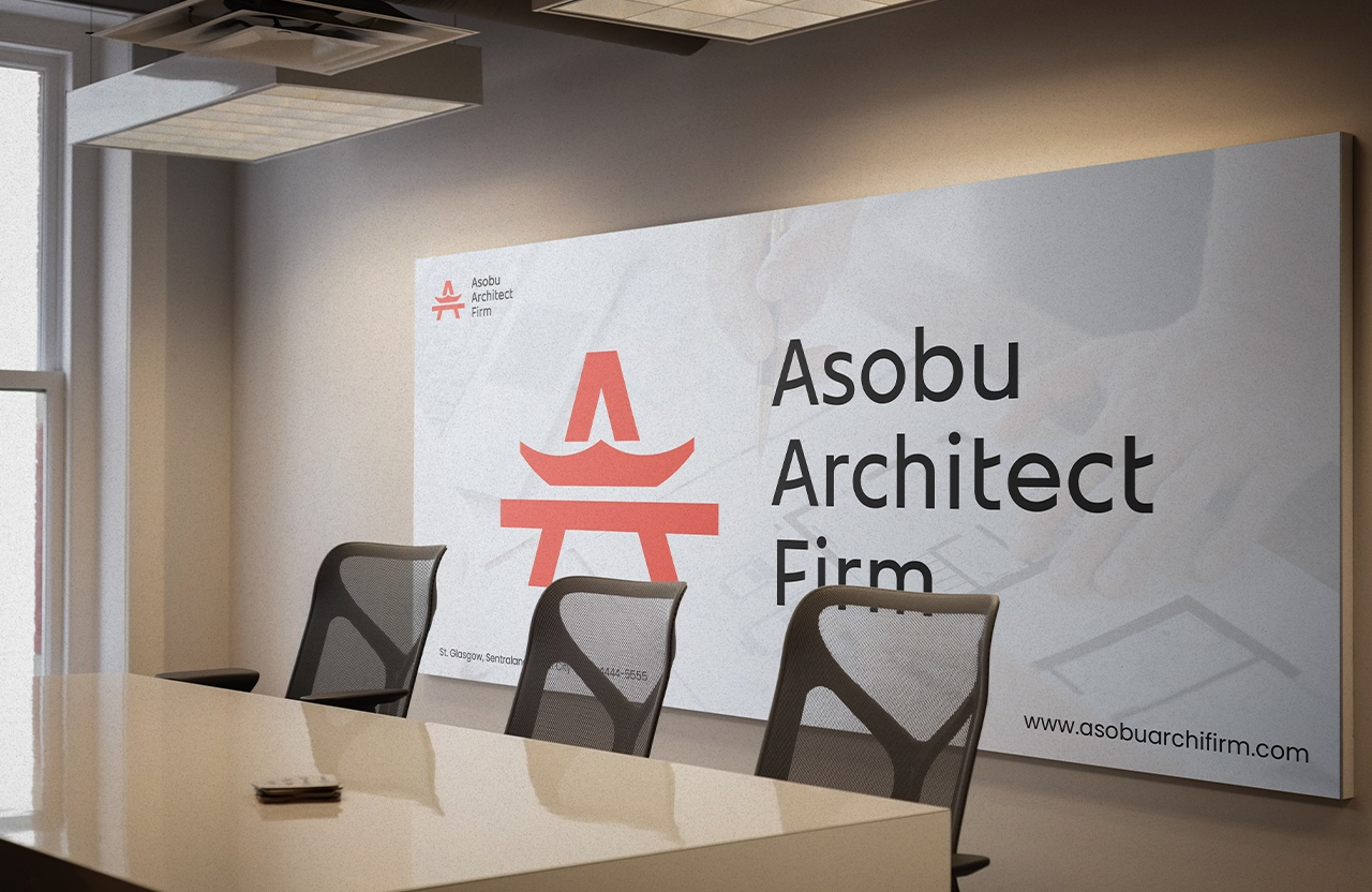
A detailed guide outlining the correct application of logo, typography, and color palette across all brand materials. This will ensure consistent visual communication across print, digital, and environmental touchpoints.

Website Design

A sleek, intuitive website that showcases Asobu Studio’s portfolio, design philosophy, and expertise. The website will be fully integrated with the updated brand identity, designed to captivate visitors and establish trust with potential clients.

This comprehensive brand overhaul will position Asobu Studio as a leader in its niche, enhancing its ability to connect with clients and thrive in a competitive landscape.

Other Project

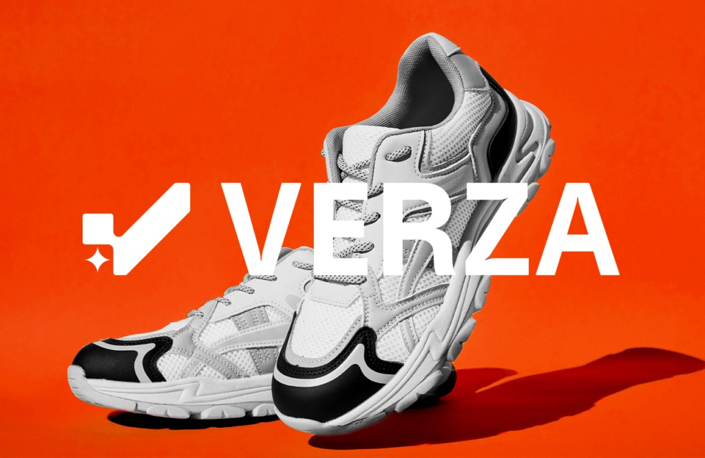
Verza sneakers Visual and branding identity
Verza Sneakers Brand and Visual Identity
Japanese-inspired design,modern Japanese interiors,minimalist branding studio,traditional Japanese aesthetics,contemporary design firm,Japanese architecture branding,modern residential design,commercial space design,serene brand identity,precision-focused branding,bespoke typeface design,earthy tone color palette,Japanese modern style,brand consistency guidelines,architectural branding experts,modern design solutions,custom logo design studio,zen-inspired visuals,Japanese culture in design,modern minimalist website design,Asobu,Asobu Architect Firm,Japanese Architect firm,Architecture Branding,Architect Firm Logo,Modern Architect Firm Logo Design,Sustainable Architecture Branding
Asobu Architect Firm
Pacera FC Branding
Pacera FC
Login Coffee Maros
Login Coffee

Have a wonderful project in mind?
Let's make it happen!